Video Recording Background Examples to Inspire Your Video Setup

Table of Contents
Maximize Your Marketing ROI
Join 10,000 other marketers already getting the best tips on running engaging events that boost pipeline and create raving fans.
Video.
It’s quickly become the centerpoint of nearly all social media platforms—even LinkedIn is joining in with their video tab.
There’s a reason why video is becoming more prevalent across channels: Video is the most engaging way to connect with others. Even in the realm of B2B marketing, video is the most effective way to engage your audience and build a long-term brand.
This means we should all be creating more videos! But creating videos takes some effort. There’s the scripting, the filming, the editing, the post production. The list goes on and on about what you need to consider when diving into video production.
But one thing people don’t put enough focus into is a video’s background! Whether your video is coming from a virtual event, a podcast interview, a self-scripted bit, or a webinar, it’s likely that your background is your actual, real-life, physical background.
If you’re thinking it’s time to upgrade your video recording background, we have you covered. We’ve scoured LinkedIn, communities, Google, and more to discover some of the best video recording backgrounds. We also break down what actually makes them great, so you can replicate the right look and feel within your own home, office, or recording studio (if you’re so lucky!).
Speaking of videos, have you heard of Content Lab? Discover how easy it is to quickly clip your videos into shorter, snappier clips in just minutes with the help of AI.
![[object Object]](https://cdn.sanity.io/images/2939l4aj/production/ef88d134ae5aa889337a96e42fe8dbc11368850d-1200x350.webp?w=800)
What makes a great video background?
Although what makes a great video background is somewhat subjective, here are a few basic pointers that will almost guarantee a better video background:
Understand Your Lighting
Get a feeling for the lighting in your room. Some people may have a studio without any natural light, but the majority of us are probably working with at least one natural light source. Get a feel for when your light is strongest and weakest (this will change with the season!) and adapt as needed.
For instance, you may not need any additional lighting if recording at noon, but may need to add an artificial light source at 3:00. You also need to be prepared for dark, rainy, and dreary days. Natural light looks best on camera, but sometimes the sun doesn’t play nice. Plus, artificial light sources give you a lot more control over your setup.
Use Some Color
The best video backgrounds use color to add intrigue, depth, and interest. Nothing is more boring than being in front of an empty wall! All the background examples below use color in some way to make their background pop, whether through lighting, props, plants, or books.
Add Some Depth
Are you sitting too close to your background? Try moving your camera (or yourself) to various positions to add some depth to your shot. This will ensure your frame is large enough to capture enough of your background and make your video background appear less flat.
Adding space between your background and yourself also allows for more fun with your lighting setup. See some examples below for inspiration on how to play with lights and depth.
15 Video Recording Background Examples to Inspire Your Video Setup
We’ve covered a bit about what makes a video recording background look great, so now it’s time to see some of them in action! Below are 15 video background examples to give you some ideas on how you could improve your video setup.
Use a Bookshelf
Sub out a plain wall with a bookshelf to instantly give your background a lift. To make it look authentic, add in some books, a few personal trinkets, a photo, and other items. But be careful not to pack too much into it; bookshelves can quickly turn messy if you’re not careful.
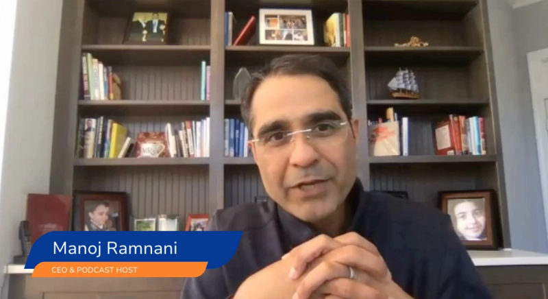
Manoj Ramnani of SalesIntel has just enough items on his bookshelf for it to be interesting but not overbearing.
Nail Your Color Palette
Color can be incredibly powerful. That’s why there’s an entire theory dedicated to understanding color. Leaning into one predominant color can not only look great, but also help you build a feeling or reaction in your audience.
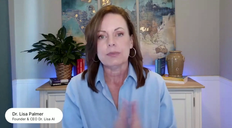
For instance, Dr. Lisa’s background gives off a serene, calm, and peaceful vibe thanks to all the blues and grays. Consider dressing in the same color palette to complete the vibe! See her setup in action:
Make it Memorable
Video is all about catching attention quickly. One easy(ish) way to do this is by making your background memorable. Add in some items that people might wonder why they’re there, which sparks intrigue. Get a little quirky! Also consider having items at different heights to make it even more interesting to look at.
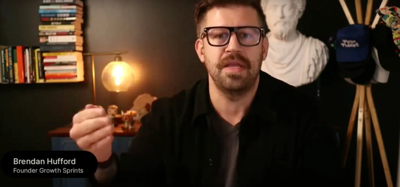
Brendan Hufford, founder of Growth Sprints, is an excellent example of how to use multiple items at different heights to build an intriguing background. What’s the story with the statue? See his background in action by playing the clip below.
Are you a fan of Brendan’s content? Catch his episode of Donuts & Demand here, where he chats about boosting conversions, why marketing is broken, and how to best use language in marketing campaigns.
Use a Corner
Adding more depth to your shot makes for a more interesting setup. To achieve this, try setting up your recording angle aimed into a corner of your room. This is especially helpful if you’re recording in a smaller room.
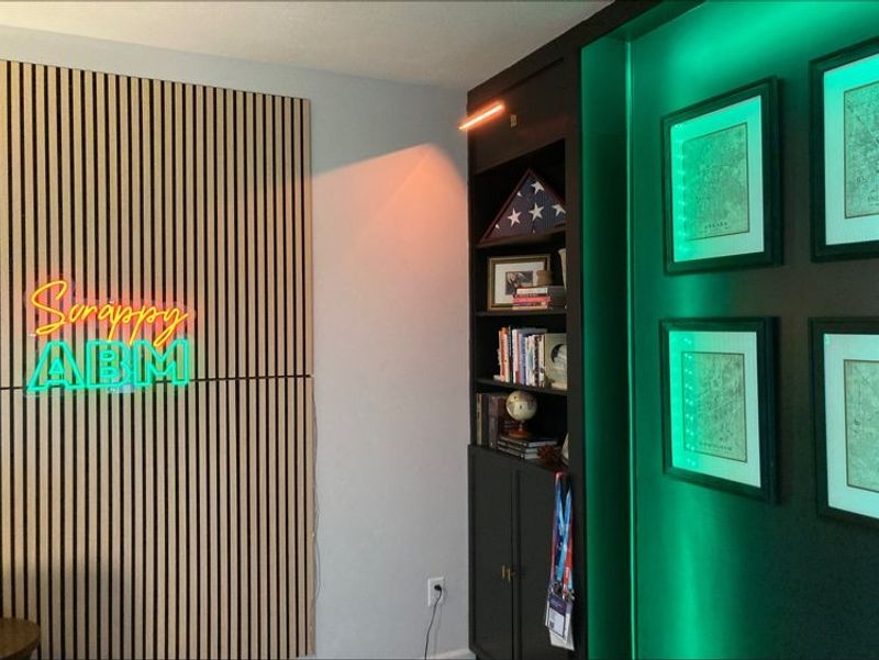
This also gives you more options when it comes to your background. Since your setup is in the corner, it gives you three unique backgrounds to work with, bringing more variety to your videos. See Mason Cosby’s example above for inspo.
Rely on the Rainbow
If you’re a fan of The Home Edit, this tip will be very recognizable to you. To give your video recording background a clean yet intriguing look, coordinate your background in order of the rainbow.
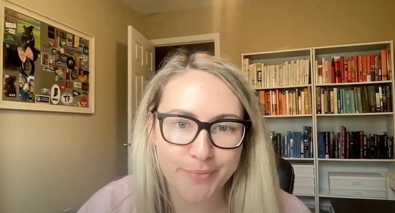
In the example above, Allyson uses this strategy by putting her books in color order. But you can do this with any items in your background, so try getting creative! If you’re a collector of something, like legos, consider displaying some of your collection in your background by arranging it in color blocks.
Here’s another example of the rainbow setup, where Guy Bauer uses a mix of books, trinkets, and art.
Add Some Plants
People love plants! Find a few low-maintenance plants, like aloe vera or snake plants, and add them to shelves, plant stands, and/or hanging baskets. Add in a few design elements by putting them into colorful or patterned pots. Here’s how Marc Thomas uses plants to balance out his background.
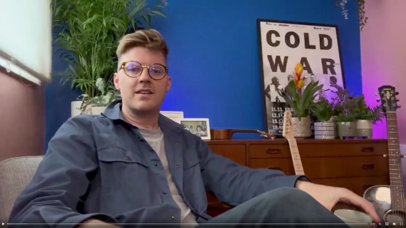
Plants can also get people talking, whether during a one-on-one chat or virtual event. They may be impressed by your green thumb or wonder what type of plants you have. It’s a great conversation starter!
Use Accent Lights
Sick of hearing about lights so much? Sorry not sorry, here’s another one all about lighting! Consider using an accent lamp and/or electric sign in your background to give some ambiance and interest to the scene.
![[object Object]](https://cdn.sanity.io/images/2939l4aj/production/3bc7634dee5f7445bc59a79d3168fbe82261cbc0-3412x1916.png?w=800)
Simon Berg uses both of these strategies with his background. A small lamp diffuses some warm light into his darker background while an electric sign pulls attention to his brand.
Try Color Blocking
Backgrounds don’t have to be overcomplicated to be compelling. Take a look at Ali Schwanke’s background that uses color blocking. When going with this strategy, consider using the colors of your brand.
![[object Object]](https://cdn.sanity.io/images/2939l4aj/production/96c843a933a93b41a4ec4c8767dfef78237de4c2-2244x1418.png?w=800)
You can do this using wallpaper, lighting, pictures, or in Ali’s case, plastic blocks!
Go Dark
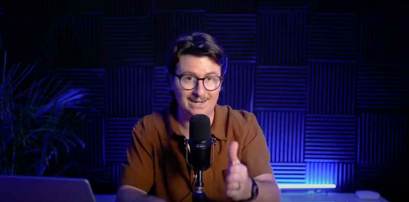
Join the darkside! You might be surprised how impactful a dark background can be. It really stands out well when presenting alongside others who might have lighter backgrounds. For example, check out Travis Tyler in this shot from our Series Masterclass: How to Create, Launch, and Grow an Event Series.
![[object Object]](https://cdn.sanity.io/images/2939l4aj/production/6f49cb1a28eeaf1fd8a58dac3a17f0111c9c78fa-3236x1838.png?w=800)
To avoid getting too boring over time, add a few lights that can change color and walla! You have yourself a dark, moody background that’s diverse and intriguing. Here’s a look at how Travis uses lighting to change it up from time to time:
Are you currently hosting (or planning to host!) a series? Get the best tips from Travis and two other series creators on How to Keep a Series Growing & Thriving.
Rely on a Pattern for Pop
One fairly easy way to give some interest and texture to your background is to add some wallpaper or decals to your wall. Consider aligning with your personal or company brand colors for an extra level of resonance with your content.
![[object Object]](https://cdn.sanity.io/images/2939l4aj/production/29a309c904bfd1f5fb4742a314bbf89734b9dddc-1920x1033.png?w=800)
Brittany Ryan, owner of Pointed Copywriting, uses wallpaper with a strong pattern to give her video background a nice pop. This might limit your ability to change your background, so be sure it’s a good fit for your look and feel before getting out the wallpaper glue.
Infuse Two Colors
Lighting can make or break your video recording background. One fun way to use lighting to jazz up your background is by using colored lighting, like Andy Owen, video producer at Block Imaging.

Using colored lighting gives you a lot of flexibility on what the rest of your background looks like. You could go simple and use the light colors as the main attraction, or give even more interest (like Andy!) by adding in shelving, trinkets, and signs alongside the two tone lighting.
Highlight Your Brand
Put your brand front and center into your video recording background by using custom signage in your background. Here’s how Rob Wilson of vidIQ does it:
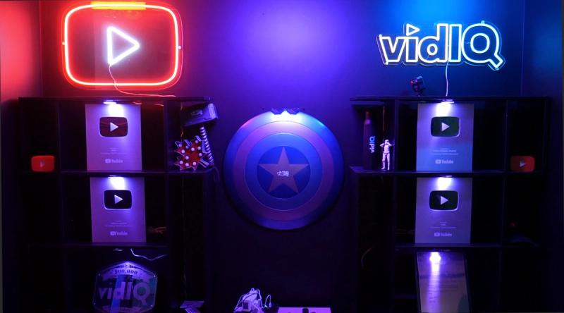
Branded lights like in his background are not super expensive and pretty easy to order nowadays. Rob purchased his on Etsy; just look for someone who does fully custom designs to ensure the lights come out 100% on brand.
P.S. Don’t worry if you’re feeling a bit behind when it comes to building your video setup. We all have to start somewhere! Here’s something to help you feel a bit better–Rob’s original setup versus his current one:
![[object Object]](https://cdn.sanity.io/images/2939l4aj/production/6640be4f5246e5b6ef520e198ba49a6109372194-1280x493.png?w=800)
Add Something Unique
As more people begin producing and sharing videos, it becomes even more important to somehow stand out in the sea of streaming videos. Try adding something personal and unique into your background to catch attention immediately.
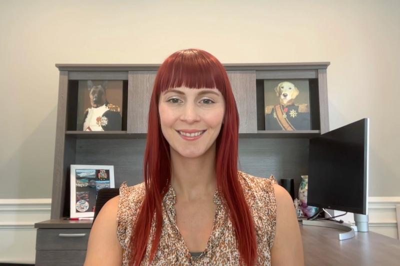
For myself, I use canvas prints of my dogs (yes, those are my real dogs!) dressed as army leaders. It’s funny, unique, and catches people’s attention quickly. Some items you could consider using include a painting, photo, statue, antique, or magnet board.
Take Up Your Entire Wall
If you’re recording a lot of video content but don’t want your background to look the same in every single video, Chris van Praag’s video setup is a great one to get inspiration from. He’s used the entirety of his wall to give him a few different background setups.
![[object Object]](https://cdn.sanity.io/images/2939l4aj/production/6f2aafef27a64214f075da840992f5d5f701d5c3-1280x1034.jpg?w=800)
Depending where he sits and how he angles his camera, his background can look entirely different from one video to the next. Adding some shelving at different levels can make this strategy easier to execute. Using a desk that can go from sitting to standing is also helpful for this type of setup.
Keep It Simple (and Centered)
You don’t have to go overboard with designing every inch of your background! Sometimes less is more, as seen here in Heleana Tiburca’s setup.
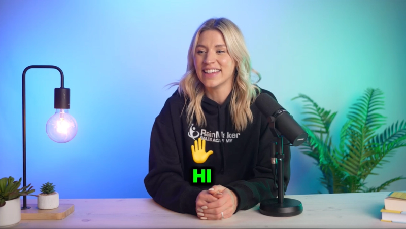
She relies on a plain (but colorful!) wall, a single plant, and an accent light to give her a simple and clean recording setup. The key to this setup is putting yourself in the center, making eyes go directly to you instead of your set pieces.
Ready to Hit Record?
Are you feeling inspired to redo your video setup and hit record? I sure hope so! If you have a cool setup to share, post about it on LinkedIn and tag us in the post or comment. We’d love to highlight it here on this list.
If you’re recording a lot of long-form video and want to find a better way to slice and dice that content into short snippets, why don’t you give Content Lab a whirl!
Content Lab is an AI video repurposing solution that turns webinars, events, and podcasts into snackable, multi-modal content. B2B marketers from companies like ClickUp, Intercom, 6sense, and Atlassian use it to increase traffic to long-form content, enrich text-based content with multimedia, and amplify brand reach across channels.

Stay In Touch
Platform
Resources
Company
Community
© 2025 Copyright Goldcast, Inc. All rights reserved.


 Upcoming Events
 Event Series
 On-Demand Events