Virtual Event Branding: The Complete Guide for Perfecting the Look and Feel of Your Next Virtual B2B Event (+ Free Checklist)
Maximize Your Marketing ROI
Join 10,000 other marketers already getting the best tips on running engaging events that boost pipeline and create raving fans.
We all love in-person events, but did you know that 73% of event attendees predict hybrid events will become the most common event format of the future?
Marketing leaders across the globe are embracing virtual and hybrid events as the cornerstone of a modern marketing strategy. But with less than 11% of virtual event attendees rating their digital event experience as ‘excellent’, the future of events belongs to those that rise above.
Event branding plays a big — and often undervalued — role in that experience.
Whether you’re totally new to the world of event branding or looking for brandtastic ways to evolve from printed signage to immersive digital experiences, this guide will help you take your events from basic to brilliant.
Here’s what we’ll cover:
- What is event branding?
- Why is event branding important?
- 12 ways to brand your virtual event
- Event branding examples we love
What is event branding?
Event branding is the practice of communicating your event’s voice, message and values through high-impact visual elements like your logo, font, and color palette that are consistently applied throughout your event website or landing page, email invitations, stage design, and other key touchpoints along the attendee journey.
Why is event branding important?
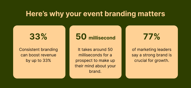
Your event branding might be the first interaction a prospect has with your company — and as we all know, first impressions count. In a world where only 10% of B2B buyers spend the majority of their journey in person-to-person interactions, you could argue that your event branding has never mattered more.
With increased pressure to deliver a strong impression digitally, standout event branding helps you create an instantly memorable experience with prospects and customers — one that drives awareness, engagement and ultimately increased return on investment (ROI).
So what exactly does event branding include? These 12 elements are a great place to start.
Unlock your brand's magic: 12 ways to make your digital events unforgettable
#1. Registration page
Your event registration page is one of your earliest opportunities to generate brand awareness. And it can have a big impact on attendance rates among potential attendees within your target audience.
From event-themed visuals to strategically placed logos, icons for social media channels, and custom colors schemes, your event registration page should make it easy to generate conversions.
💡Top tip: Customize your registration fields to collect crucial attendee insights like company name, job title, and LinkedIn URL.
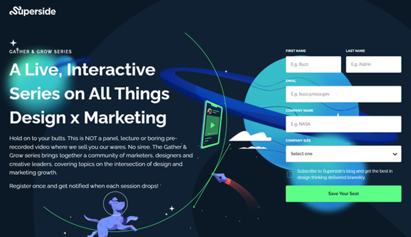
Source: https://www.superside.com/lp/gatherandgrow
#2. Logo
Using your own logo — and never Zoom’s — is a no-brainer. This is a subtle yet crucial way to ensure all the unforgettable engagement opportunities are attributed to your brand, not someone else’s.
💡Top tip: Ensure your logo stands out from your event background(s) and can be easily seen across sessions and pages.
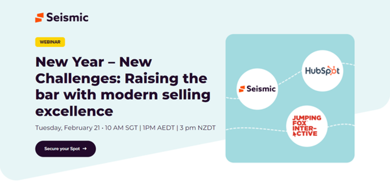
Source: https://learn.seismic.com/webinar-jumping-fox-interactive-hubspot-sales-leaders-virtual-session.html
#3. Stage background or hero image
While a well-positioned logo is crucial to modern event branding, it’s far from the only element that can give your event a memorable look.
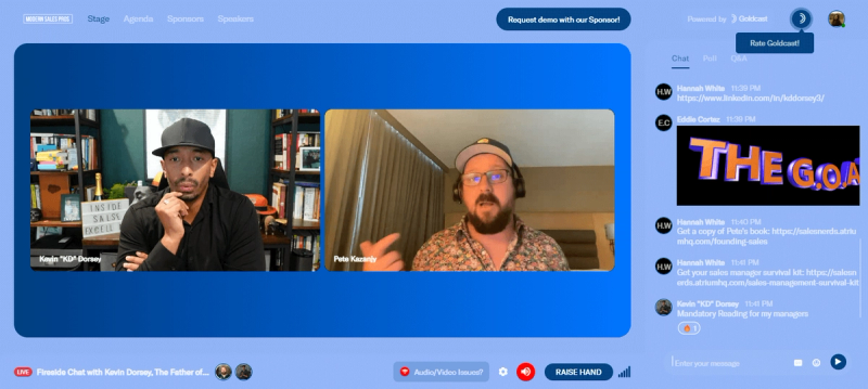
Your stage background is arguably the most important part of your digital event as it’s often the first thing attendees see when they enter your event.
That’s why it’s important you have the option to:
- Upload a hero image
- Select a single solid color
- Create a gradient effect to include more shades from your brand’s palette
💡Top tip: Optimize your landing page background for both mobile and desktop users.
#4. Favicon
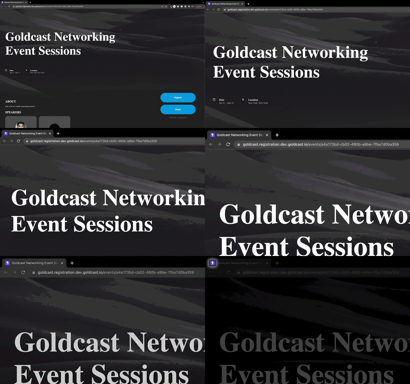
A favicon is a tiny icon that represents your brand in the address bar of any browser your attendees are using. It’s small, but mighty. ✊🏼
For better or worse, virtual attendees are busy. There’s a very real chance they’ll have to pop out of the live event from time to time. Make it easy for them to navigate right back in with a branded favicon.
💡Top tip: Make your favicon recognizable even at a small scale — nothing too intricate.
#5. Font
Film director Errol Morris conducted an experiment. After polling 45,000 people, the conclusion was that typeface absolutely impacts our feelings towards what we’re reading.
Your attendees trust consistency, so be sure to use your own brand fonts across every area of your event.
💡Top tip: Choose two font types — one for headers and one for everything else.
#6. Call to action buttons and card color
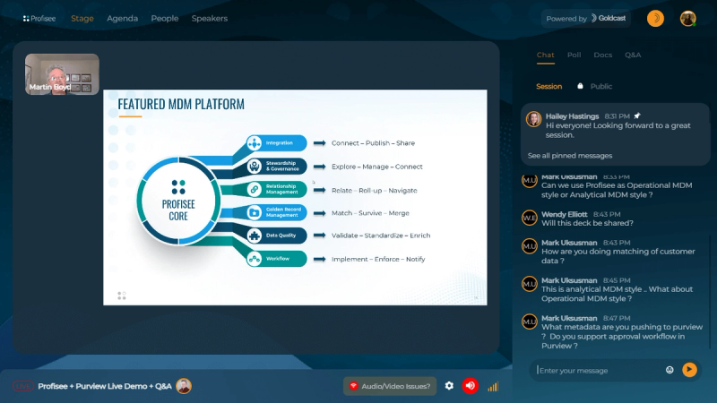
From driving Q&A interaction to initiating sales conversations via live demo requests, a well-branded call to action (CTA) button can have a big impact on your core event KPIs.
💡Top tip: Think about your platform backgrounds and font colors. If your CTA blends in too much, attendees may miss it!
#7. Virtual background
Whether it’s a rogue intruder making an unwanted appearance, or simply an out of place object ruining the professional vibe, many of us have learned the hard way that a virtual background is the way to go.
Upload a variety of branded background images for your event speakers and keynotes to choose from, or let them opt for the classic blur effect.
💡Top tip: Avoid off-brand awkwardness by previewing your speaker’s background backstage before they go live with their presentation.
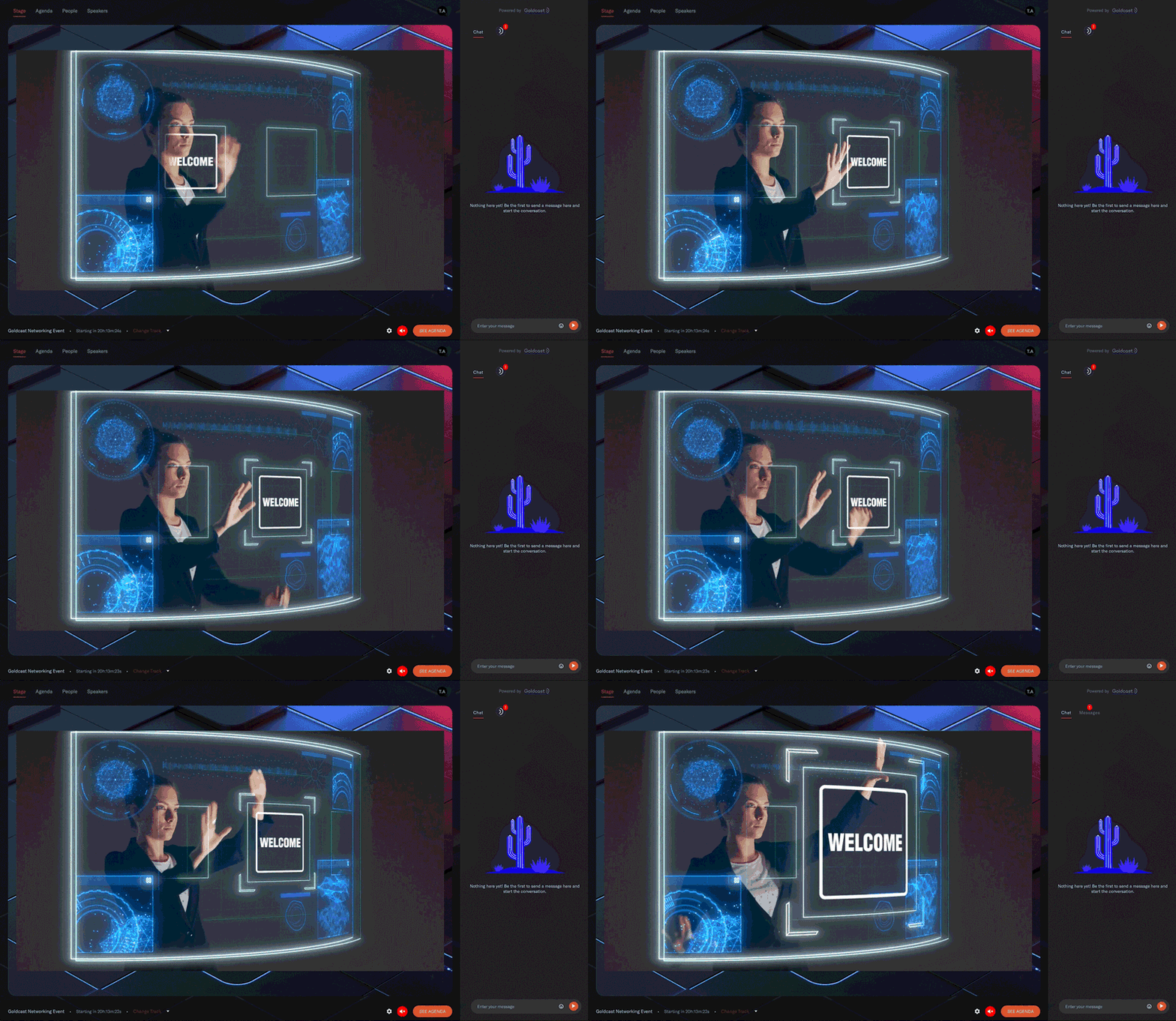
#8. Buffer or loop video
A high-energy way to greet your guests (and keep them occupied between sessions) is a looped buffer video set to autoplay.
You can use this looped video to showcase your product, introduce sponsors, or simply entertain.
💡Top tip: The suggested amount of time for a buffer video is two minutes.
#9. Name cards
When the time comes for your rockstar speakers to take the stage, be sure to utilize a well-branded name card to spotlight their name, title, and company in colors that match your event branding.
💡Top tip: Try out different name card variations using Goldcast’s simple reverse colors toggle.

#10. Sponsor logos
As the organizer, your branding is clearly priority number one. But your sponsors’ branding also has to be a priority.
Upload sponsor logos or images to share on stage during your event and select a location for them to appear (one of four stage corners, top-middle, or bottom-middle).
💡Top tip: Collect 1:1 ratio, high quality logos from your sponsors.
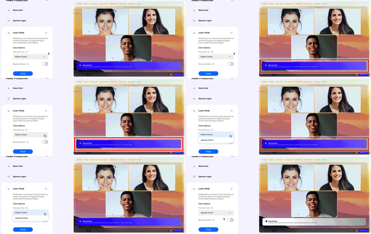
#11. Chat banners
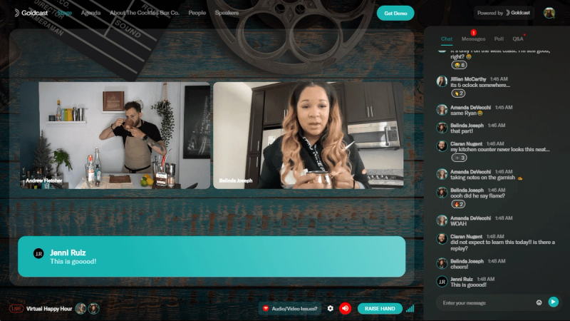
With branded chat banners, moderators can take classic engagement features like chat messages and position them center stage for all to see.
Branded chat banners give you an extra opportunity to show off your brand colors, spark conversation, take questions, and collect feedback.
💡Top tip: In Goldcast, you have the option to use your button or agenda colors for chat banners. Preview both before your event starts to see which one stands out best.
#12. Pre and post-event emails
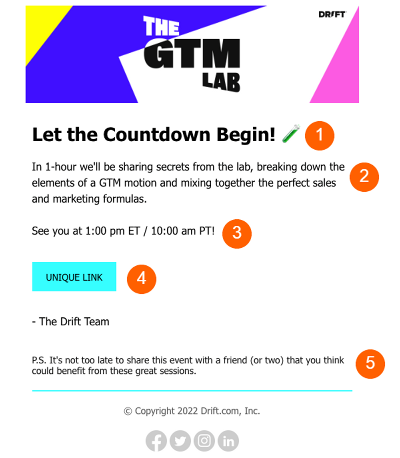
Branded event emails are a crucial part of event promotion and follow-up strategy.
Make sure your event email marketing — including your templates, designs, and formatting — are all in perfect alignment for a pre- and post-event experience that flows. Even if you’re sending these emails directly from your event platform, it should feel like they’re coming from your brand.
💡Top tip: Add a magic link to your pre-event emails to eliminate barriers and help boost those attendance rates!
Brandspiration: Virtual event branding examples that have us swooning
Knowing what features to use is one thing. Knowing how to use them is quite another.
At Goldcast, our customers have broken the mold with event branding blueprints that bring it all together. If you’re looking for event branding examples that will keep your target audience coming back for more, you won’t want to miss these.
Creating an unmistakable event ID with Drift’s GTM Labs
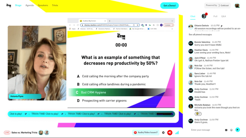
Drift’s carefully curated brand identity is a big part of what makes them stand out. And true to form, their bright and personable branding is a central part of their immersive GTM Lab event experience.
From the expertly-branded landing page to the moment you click the magic link to enter the event, the colors, logos, and tone of voice all come together to let you know that, without a doubt — you’re at a Drift event. ⭐
Telling a compelling story via Alyce’s YOUniverse event
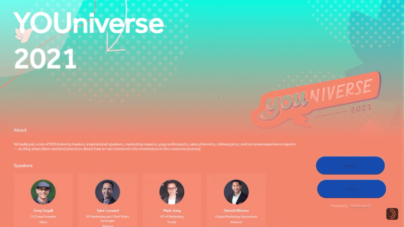
The name ‘YOUniverse’ is a real give-away.
Because, as a truly customer-centric company, Alyce’s digital event branding is fundamental to telling their story and maintaining a close relationship with prospects and customers. We love the instantly recognizable color gradient and the fact that the event branding is so consistent — spanning every touchpoint from the event registration page, to its content, and follow-up communications.
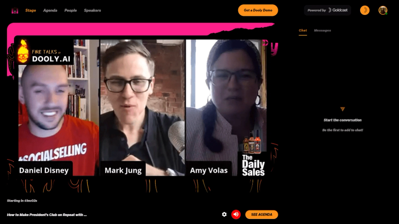
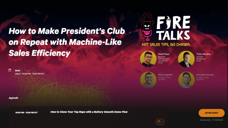
Going bigger and bolder with Dooly’s FireTalks
Dooly’s hot pink color scheme isn’t the only part of their FireTalks branding that packs a punch.
From a knockout logo to a flame-themed event background and even a hot-sauce content segment, Dooly’s event team knows how to turn up the heat when it comes to event branding.
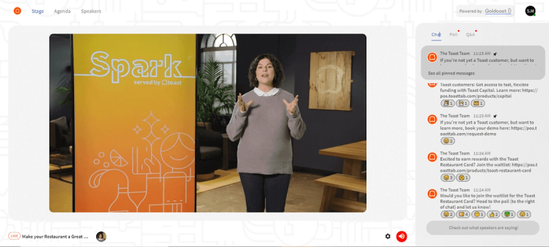
Setting a swoon-worthy stage like Toast’s digital Spark event
For Toast, a generic side-by-side video conversation wasn’t going to give them the polished look their Spark event required.
Instead, the Toast team created the ultimate hybrid interview stage — an ‘in real life’ meeting room for the interviewer, with a high resolution TV screen displaying the remote interviewee.
And for a little extra brand appeal, see if you can spot the branded Toast swag dotted around the set. 🕵🏻
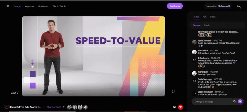
Keeping it clean like ThoughtSpot’s digital Beyond conference
By sticking to their ultra-clean black and white branding, the business intelligence pros at ThoughtSpot were able to add subtle splashes of color to their pre-loaded presentations, decks, and live sessions to really make their Beyond conference messaging pop.
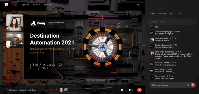
Keeping to theme with Kong’s Destination Automation event
When selecting a theme for their annual summit, Destination Automation was a no-brainer for the automation all-stars at Kong.
As well as the event content, Kong’s consistent branding across their virtual event platform strategically spoke to its theme, with API visuals spanning the lobby, agenda, speaker, and presentation pages. #dreamtheme
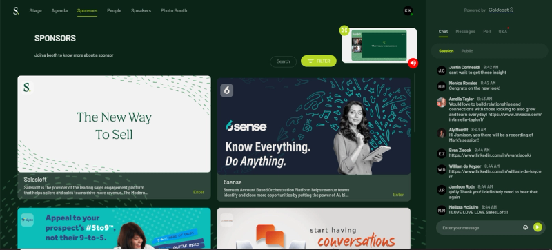
Embracing brand consistency with Salesloft’s Virtual Summit
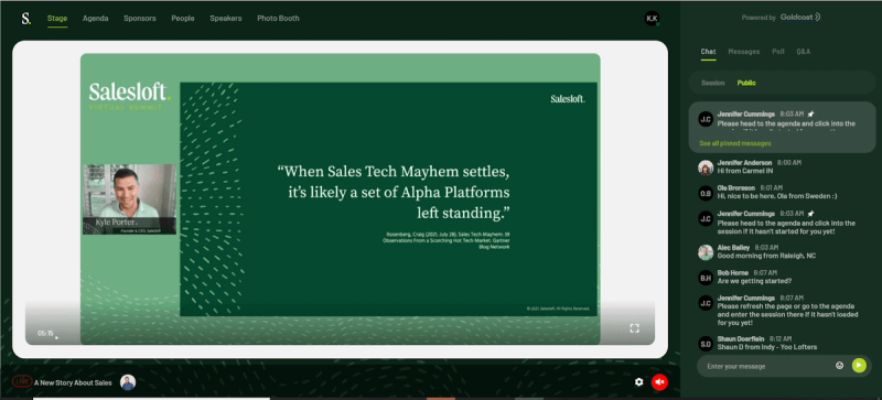
Across sponsor booths, presentations, breakouts, and beyond — Salesloft’s signature color remains the number one constant that attendees, prospects, and clients expect to see at Salesloft’s events — even down to Founder and CEO Kyle Porter’s cool-as-a-cucumber event attire. 😍
Making a powerful impression with Weave’s Beyond the Obvious webinar
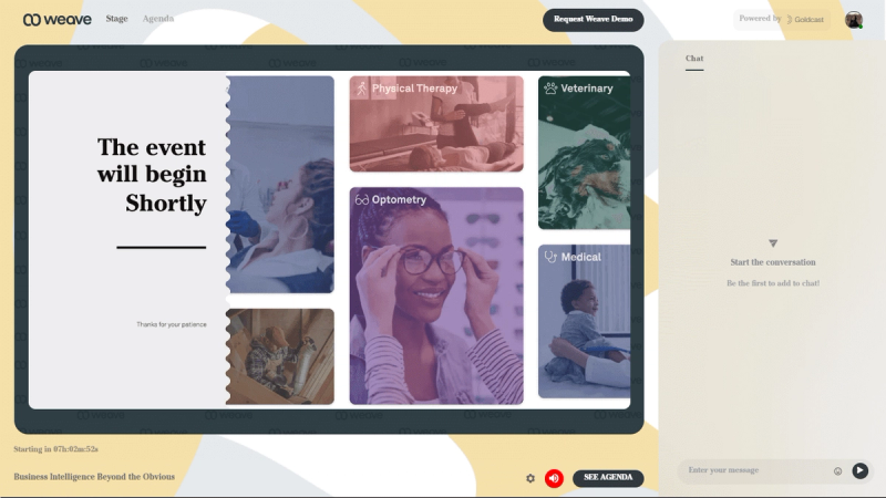
To set the right tone for their event, the team at all-in-one communication platform Weave knew they needed to kick off with the right visuals.
They used a looped pre-event video to play before attendees entered the event. This helped capture attention asap, while giving the team at Weave a prime opportunity to show off their brand, products, and sponsors.
Striking a balance between subtle and strong with Clari’s digital roundtable events
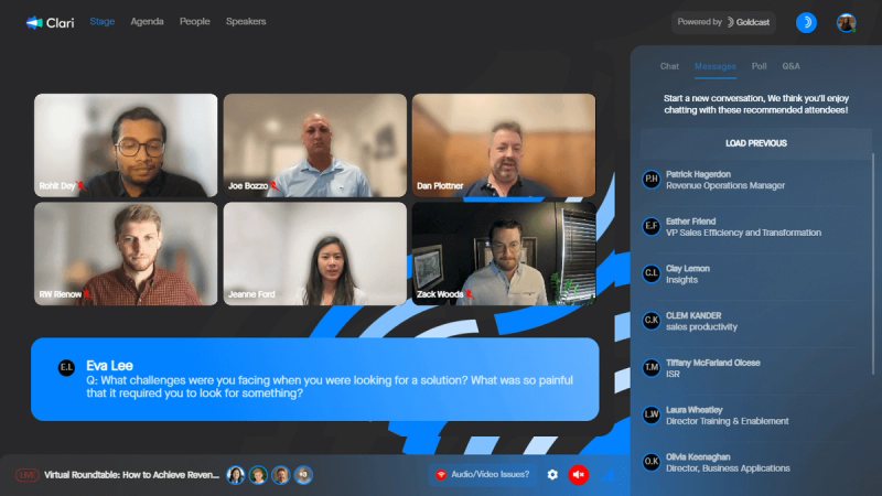
For revenue platform Clari, simply applying their branding to the lower-third element of their event helped them avoid the hard sales pitch and increase conversions by keeping it classy. With a subtle alternative to highlighting convo-starters and CTAs, Salesloft’s digital event branding never makes attendees feel like they’re being sold to.
Bespoke branding at the Nexthink Experience Everywhere conference
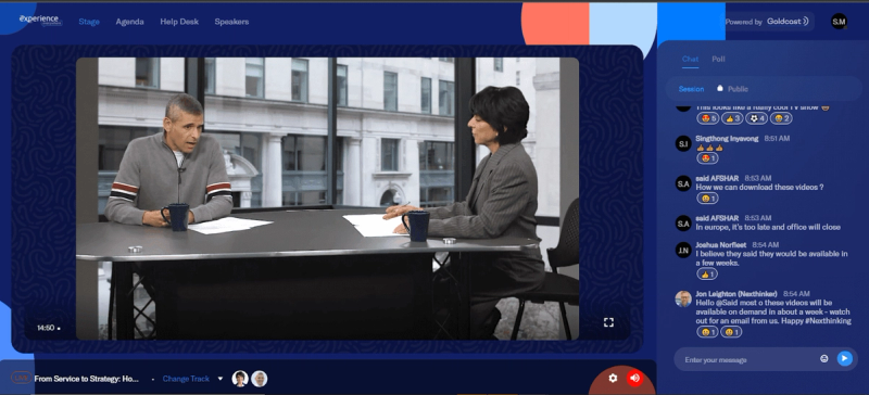
By blending their blue and coral color palette throughout their virtual conference, Nexthink’s marketing and event content is completely seamless, giving the impression of a bespoke in-house meeting at their Experience Everywhere event.
Setting the right tone with Goldcast’s Behind The Scenes experiences
Above all, the goal is to match your event branding to the emotion or ‘vibe’ you want to create.
Here at Goldcast, our Behind The Scenes experiences combine product and feature demos with a just-for-fun hands-on masterclass for attendees. By producing a field event that combines live sessions with pre-recorded reels that match the event theme, we were able to achieve the ultimate virtual happy hour vibe. 🥂
Unleash your brand's charm and rake in the event ROI gold
The modern role of the event marketer goes far beyond event planning. But with a growing list of priorities, it can seem impossible to find time to focus on the details of your event branding.
That’s where Goldcast comes in. Our white-label event branding features give you full control over all the branded elements of your event — from your registration page to your follow-up emails and everything in between.
Make your next virtual event easy to look at and execute. With Goldcast, you don’t need a team of designers to execute a flawlessly branded event. Just hit publish and you can easily duplicate and scale your fully-customized events.

Stay In Touch
Platform
Resources
Company
Community
© 2025 Copyright Goldcast, Inc. All rights reserved.


 Upcoming Events
 Event Series
 On-Demand Events