Most Webinars Are Boring — Here Are 12 Better Ways to Brand Your Event With Goldcast

Table of Contents
Maximize Your Marketing ROI
Join 10,000 other marketers already getting the best tips on running engaging events that boost pipeline and create raving fans.
When it comes to digital events, branding is something that’s long been an afterthought. And until recently, you’d have been forgiven for that.
Because at the onset of digital events, the ability to do anything beyond a shared slide deck or roller banner in the background of a speaker’s video simply wasn’t there. But with digital events now playing a fundamental role in modern field marketing strategies, event platforms are finally making it easy to elevate your branding.
At Goldcast, we’re here to help event marketers wave goodbye to clunky, ill-fitting systems and create a scalable events program that puts the attendee experience above all else.
How exactly? Glad you asked! It all starts by customizing the right elements in the right areas of your digital events — starting with these 12 branding ideas.
12 key areas for better digital branding
- Registration page
- Logo
- Stage background
- Favicon
- Font
- Call to actions
- Virtual background
- Buffer video
- Name cards
- Sponsor logos
- Chat banners
- Emails
📈 Stay up to date with the latest trends in our B2B Webinar Benchmark Report
#1. Registration page
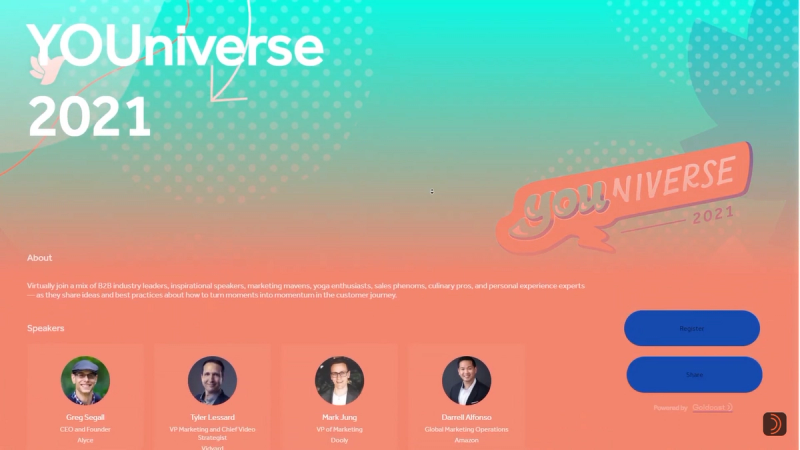
Let’s start at the beginning. Your event registration page is one of the earliest opportunities to start generating brand awareness, so it’s crucial to make an impact.
We built Goldcast with fully customizable features to give marketers total control over the event registration process for an entirely branded experience for incoming registrants.
With a range of deep customization options — from themed backgrounds, colors, custom gradients, fonts, and more — your brand will be instantly recognizable from the moment visitors land on the page.
Pro tip: Don’t forget to customize your registration fields to collect all the right info on your attendees. Consider useful insights like company name, job title and LinkedIn URL.
#2. Logo
Adding a logo to your digital event is a clear no-brainer. For years, this was possibly the only “custom” branding element offered by the majority of virtual event and webinar platforms on the market.
Today, there’s so much more you can do with it.
By uploading a high resolution logo to your digital event platform, your live event goes from basic to bespoke in an instant. But what really makes your brand shine is subtly using your logo to create a dynamic experience as attendees navigate your event. In every digital room, stage and event tab, your logo will remain seamlessly present in the upper left hand corner of the screen.
Protip: For annual and serialized events, why not create a custom event logo with its own visual ID that aligns with your overall motif? Oh, and don’t forget to aim for pixel perfection with a PNG or SVG logo file with a 1:1 aspect ratio!
#3. Stage background color or hero image
While a well-positioned logo is crucial to modern event branding, it’s far from the only element that can give your event a memorable look.
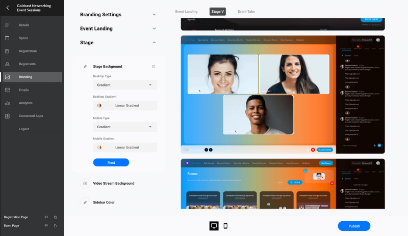
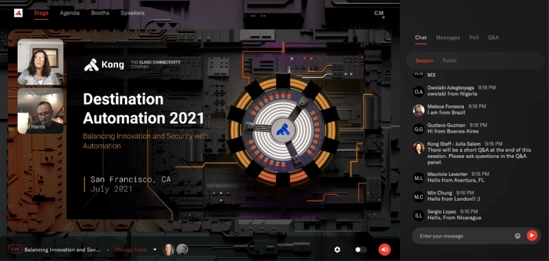
Your stage background is arguably the most important part of your digital event as it’s often the very first thing attendees see when they enter your event.
In Goldcast, you can create a high-impact stage background in three simple steps:
- Upload a hero image
- Select a single solid color
- Add a gradient effect to include more shades from your brand’s color palette
Protip:Check that your landing page background is optimized for both mobile and desktop users — if your hero image doesn’t scale well, switch it out.
#4. Favicon
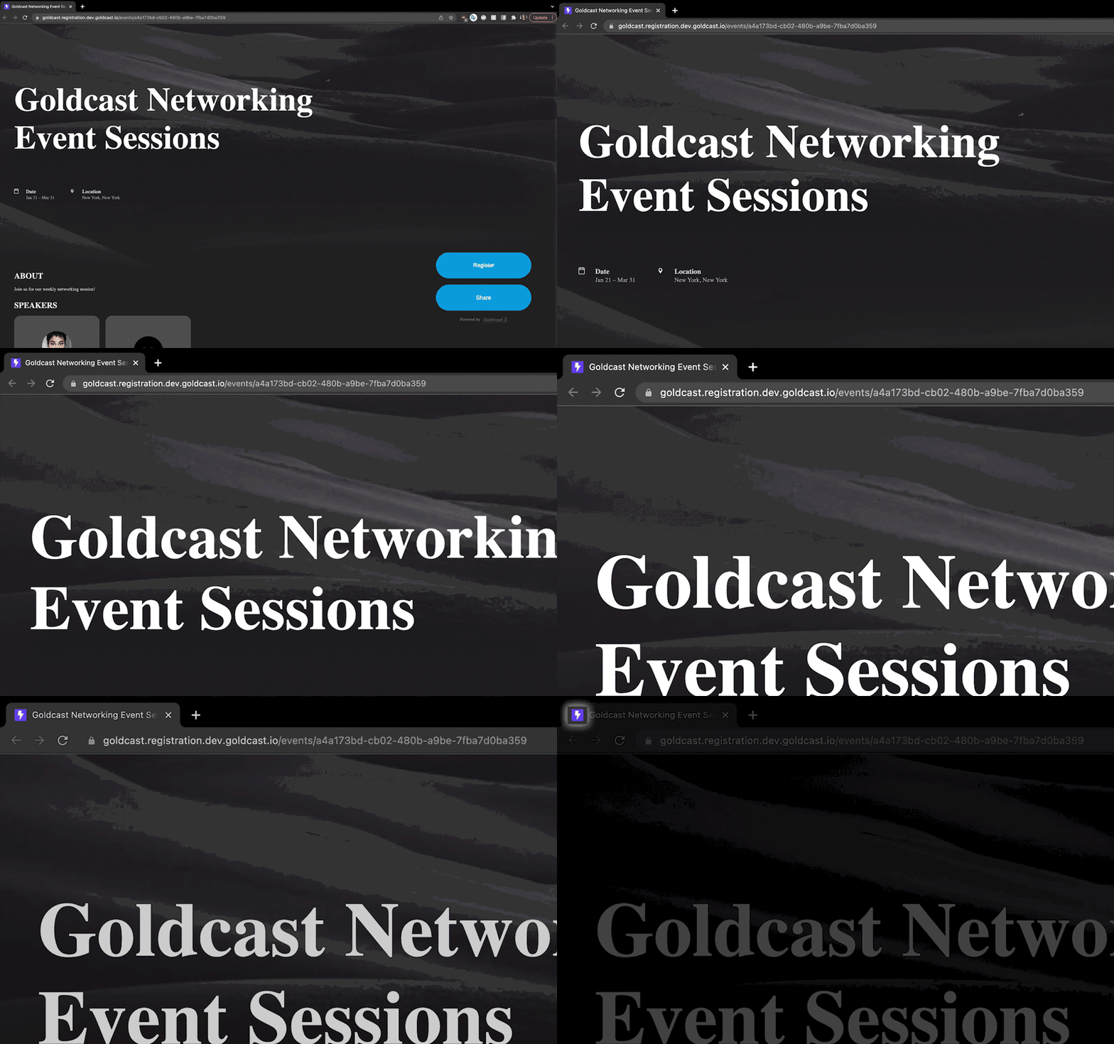
A favicon is a tiny icon that represents your brand in the address bar of any browser your attendees are using. It’s small, but mighty. ✊🏼
And unfortunately, it’s a brand element that many of the all-things-to-all-people event platforms tend to miss. That’s a problem, because seeing a random platform provider’s logo in an attendee’s browser tab instead of your own is a small but real interruption in what could have otherwise been a completely immersive brand experience.
For better or worse, virtual attendees are busy. There’s a very real chance they’ll have to pop out of the live event from time to time. Make it easy for them to navigate right back in with a branded favicon.
Protip:Focus on making your favicon recognizable even at a small scale. If your logo is too intricate, it won’t minimize well. Aim for something simpler, but still on-brand.
#5. Font
In 2012, film director Errol Morris conducted an experiment to understand if fonts alone were enough to influence consumer trust levels.
After polling 45,000 people, the conclusion was that typeface absolutely impacts our feelings towards what we’re reading, with respondents more likely to believe a statement written in Baskerville than Computer Modern, Georgia, Helvetica, Trebuchet, or Comic Sans.
When it comes to creating a beautifully branded event, you need a vast library of fonts to choose from. In Goldcast, you can choose from a wide selection of popular fonts, or use your own web and custom fonts for a completely branded experience from end to end.
Protip: To keep your UX as audience-friendly as possible, stick to two font types — one for headers and one for everything else.
#6. Call to action buttons
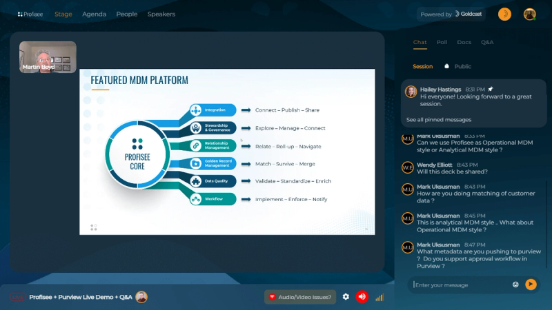
Call to action (CTA) elements are a critical part of every event. From driving polls and Q&A interaction, to initiating sales conversations or requesting a demo — your CTA buttons are intrinsically linked to your event key performance indicators (KPIs).
The sweet spot with CTA buttons is to choose a color that complements the rest of your event branding, but still stands out against your background images to make it easy for attendees to click.
Protip: Be mindful of the colors you’ve chosen for your platform backgrounds and fonts. If your CTA blends in too much, attendees may miss it!
#7. Virtual background
Let’s face it, we’ve all heard (or even seen 👀) an embarrassing tale about a webcam background failure.
Whether it’s a rogue intruder making an unwanted appearance, or simply an out of place object ruining the professional vibe, we’ve learned the hard way that a virtual background is the way to go.
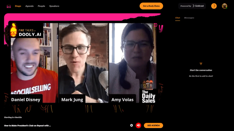
In Goldcast, you can upload a number of background images for your speakers to choose from, or let them opt for the tried-and-true blur effect.
Protip: Don’t forget to ask speakers to preview their virtual background when they’re in the backstage area (to avoid any off-brand awkwardness 😬).
#8. Buffer video
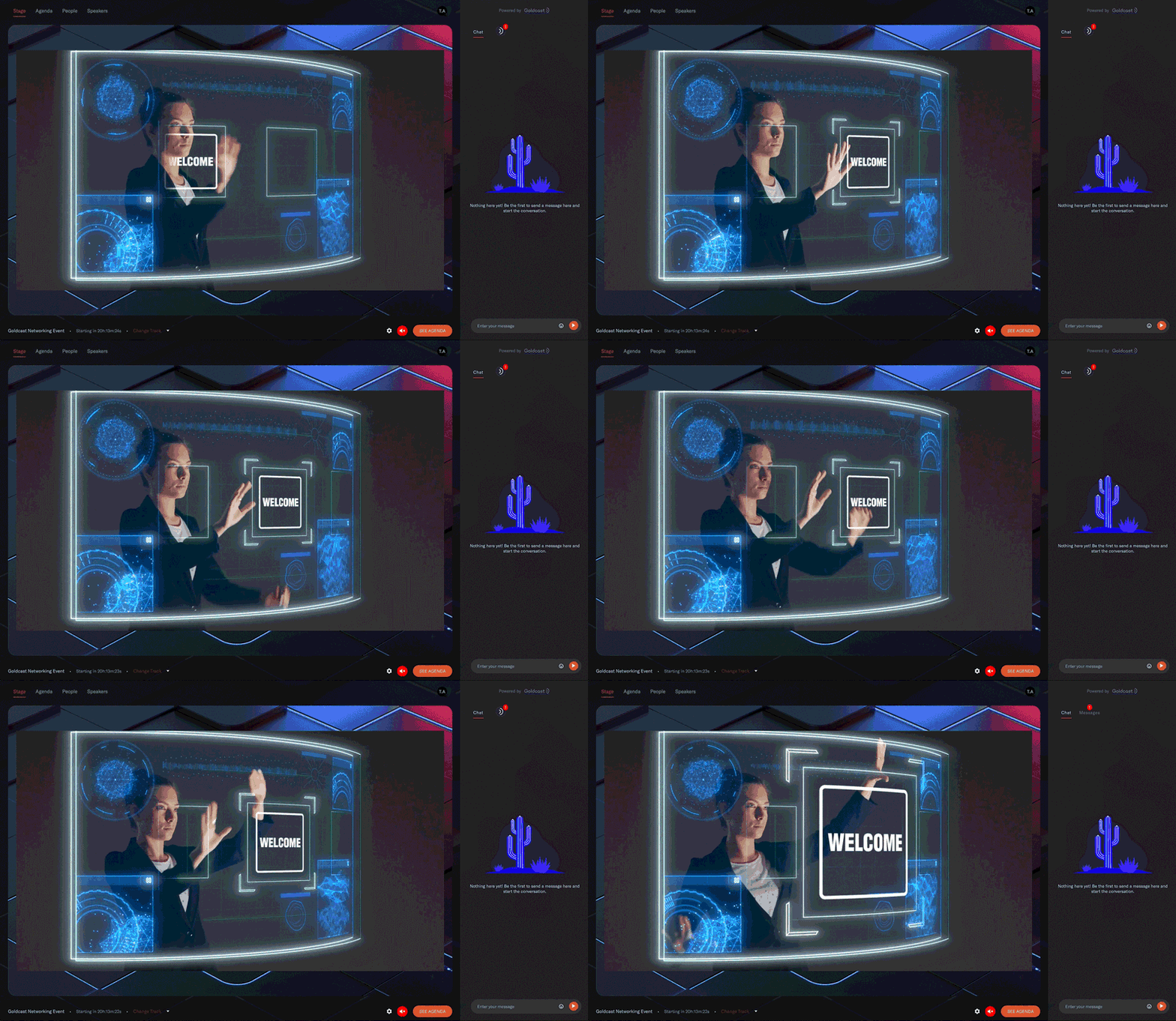
From the moment your attendees take their first virtual steps into your event, you want them to be dazzled. One high-energy way to greet your guests — and keep them engaged between sessions — is to use a looped buffer video set to autoplay.
With ample video space to showcase a product, introduce your sponsors, or simply entertain your attendees, the buffer video is a great way to boost your brand and keep attendees sticking around for more.
Protip: While there’s no minimum or maximum amount of time required, two minutes is considered a good length of time for a high-impact buffer video.
#9. Name cards
Speakers are a big part of the reason attendees show up. So when the time comes for your rockstar speakers to take the stage, be sure to utilize the branded name card feature to shine a spotlight on your headliners.
With Goldcast’s easy name card customization, you can scrap the out-of-the-box title placeholders and create a name, title, and company card in colors and fonts that align with the rest of your live event.
Pro tip: Try out different name card variations using the simple reverse colors toggle.

#10. Sponsor logos
As the organizer, your branding is clearly priority number one. But your sponsors’ branding has to be up there on that agenda too — especially if you’re among the 23% of event marketers who cite sponsorship as their primary source of digital event revenue.
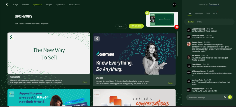
With Goldcast, you can upload sponsor logos or images to share on stage during your event and select a specific location for them to appear — one of the four corners of the stage, top-middle, or bottom-middle.
Pro tip:Collect high quality logos from your sponsors in advance and ensure they’re in a 1:1 ratio for peak quality and visibility.
#11. Chat banners
When it comes to digital events, engagement is everything.
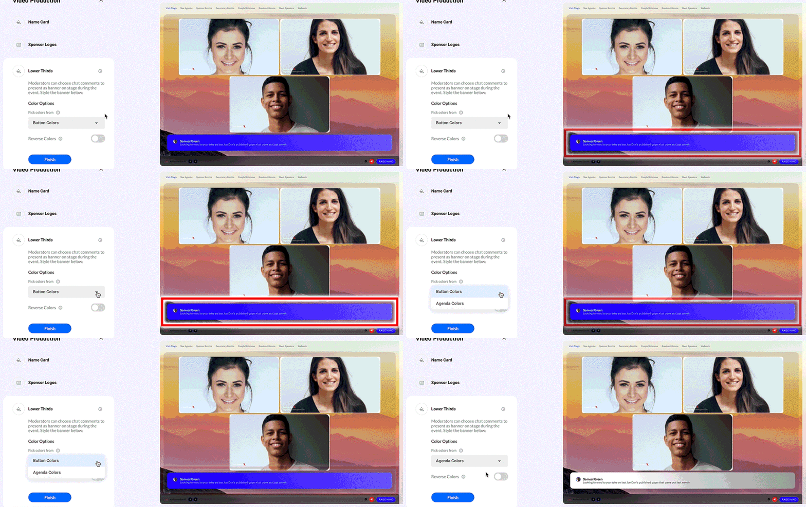
With branded chat banners, moderators can take classic engagement features like chat messages and set them center stage for all to see. This small detail gives you an extra opportunity to showcase your brand, but more importantly, it’s a great way to spark conversation, take questions, and collect feedback in a way that feels as familiar as using your favorite social video app.
Protip:In Goldcast, you have the option to use your button or agenda colors for chat banners. Preview both before your event starts to see which one stands out best.
#12. Pre- and post-event emails
If you’re like most event marketers, increasing your show rate is absolutely a goal. And boosting revenue? Well, that’s even more crucial.
That’s where beautifully branded pre- and post-event emails can help move the needle.
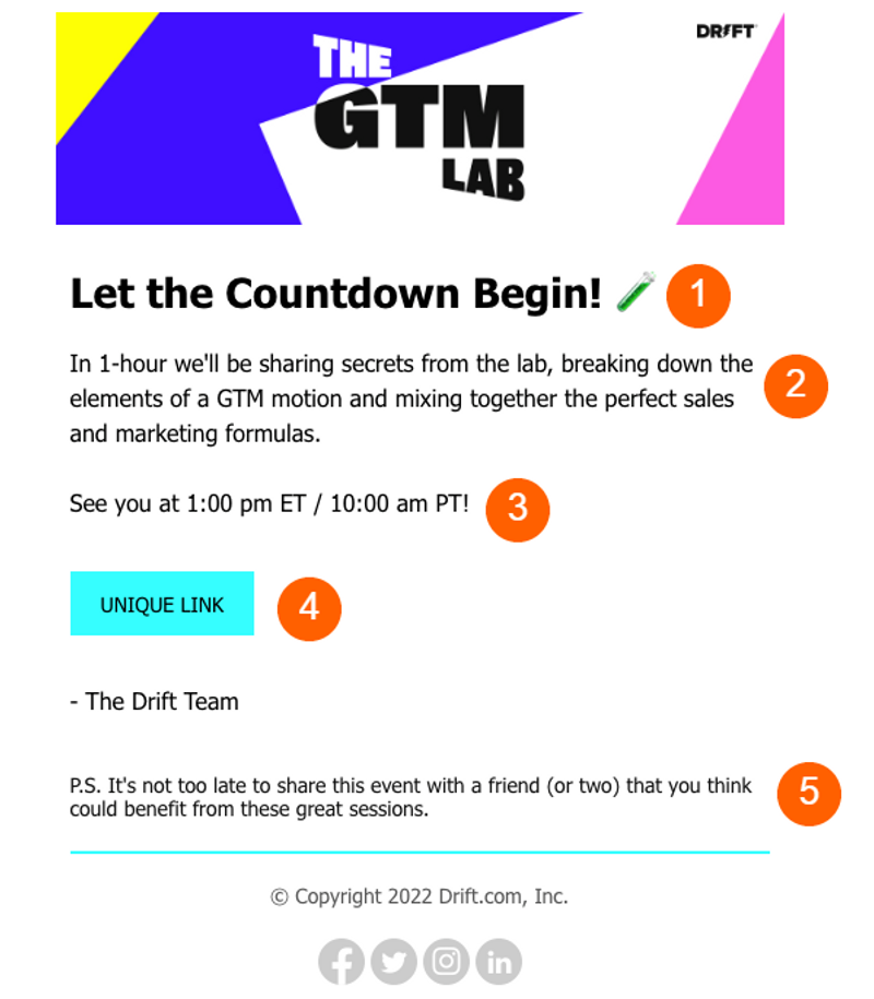
For Lita Carpenter, Marketing Manager at ILS, branded event emails are a crucial part of any event promotion and follow-up strategy:
“The ability to take our email templates, designs, and formatting and transpose them onto the emails that Goldcast sends out makes everything flow,” says Lita. “From a user experience perspective, it feels like everything was being run by us, even though Goldcast was doing the heavy lifting.”
Protip:Add a magic link to your pre-event emails to eliminate any attendance barriers and help boost those attendance rates!
Gold star branding with Goldcast ⭐
At Goldcast, we know how much time, planning, and energy goes into creating even a single standout event. And we’re big believers in making the lives of (the often unsung) event marketing heroes just that little bit simpler.
Our platform was purpose-built for B2B marketers who know that every experience with a brand matters. Since day one, we’ve doubled-down on creating premium digital event branding solutions that are easy to implement, simple to scale, and pack a much harder punch than yesterday’s legacy platforms.

Stay In Touch
Platform
Resources
Company
Community
© 2025 Copyright Goldcast, Inc. All rights reserved.


 Upcoming Events
 Event Series
 On-Demand Events