The 15 Best Webinar Landing Page Examples to Get More Attendees
Table of Contents
Maximize Your Marketing ROI
Join 10,000 other marketers already getting the best tips on running engaging events that boost pipeline and create raving fans.
When was the last time you were invited to a webinar? Last week? Yesterday? Five minutes ago? Webinars are everywhere. If you want yours to stand out in a sea of competition you need to make a great first impression, starting with a high-quality webinar landing page.
Organizers and attendees love webinars because they’re:
- Convenient - 74% of attendees enjoy attending events from anywhere
- Affordable - 51% of attendees like that they’re cheaper than in-person events
- Accessible - 42% want hassle-free access to digital event materials
- Efficient - 48% name efficiency as a reason for attending
With the ease and flexibility a webinar can offer, it’s no wonder 81% of attendees are more willing to sign up for digital events compared to in-person.
But with a whopping 72% of attendees saying that using the right tools for a seamless registration process is key to their experience, you can’t afford to cut corners.
If you're ready to increase your webinar registrations and attendance rates, don’t miss these all-star examples of webinar landing pages done right.
Meet the best webinar landing page examples
- Sparktoro
- Zendesk
- Fetcher.ai
- Salesloft
- ThoughtSpot
- Seismic
- Superside
- PandaDoc
- Zuora
- SureCo
- Introhive
- Smartling
- Lattice
- 1Password
- Sisense
The 15 best webinar landing page examples to get more attendees
1. Sparktoro Office Hours
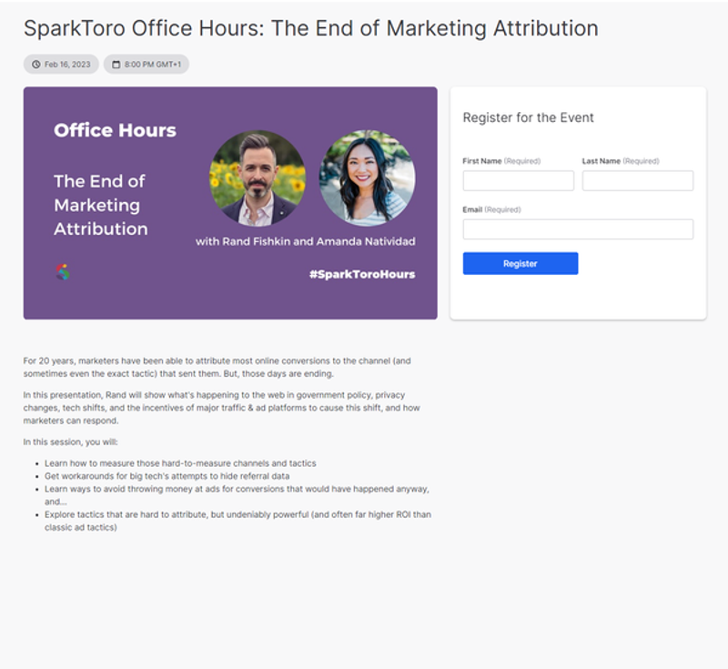
What we 🧡:
- Bold headline
- Speaker headshots right at the top of the page
- Short and sweet registration form
- Company name is the first thing you see
What we’re missing:
- Stronger CTA (e.g., ‘Sign me up!’ or ‘Register now’)
- Speaker bios / profile links
2. Zendesk’s ‘coffee date’ webinar
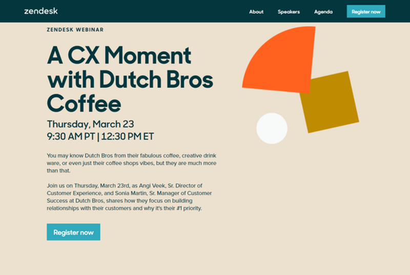
What we 🧡:
- Time and date details immediately stand out
- Clear and concise copy
- Friendly sendoff and CTA button at the bottom of the page
What we’re missing:
- No speaker headshots
3. Fetcher.ai’s trendspotting webinar
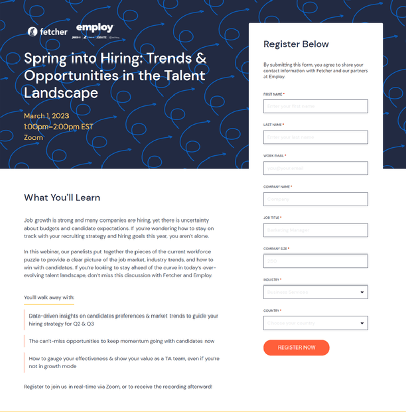
What we 🧡:
- High-impact value proposition
- Prominent logos
What we’re missing:
- Signup form has a lot of mandatory fields
4. Salesloft’s behind-the-scenes webinar
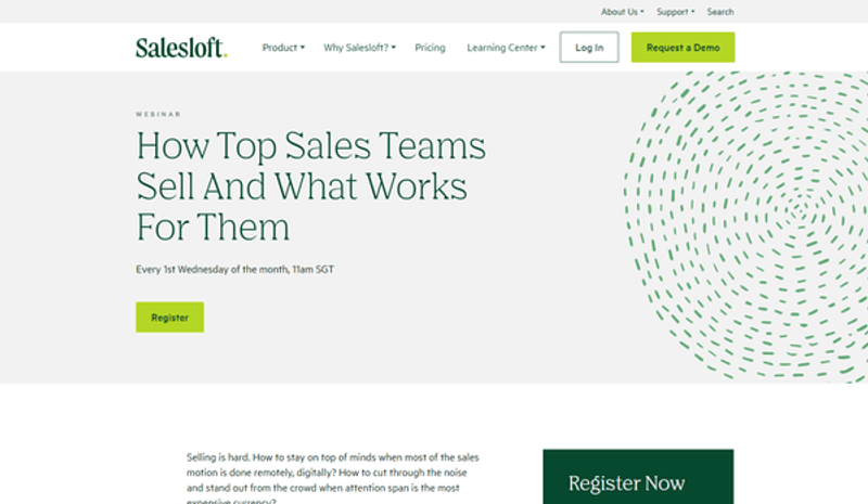
What we 🧡:
- Clear headline and value prop
- Multiple CTAs
What we’re missing:
- Speaker details
5. ThoughtSpot’s product showcase
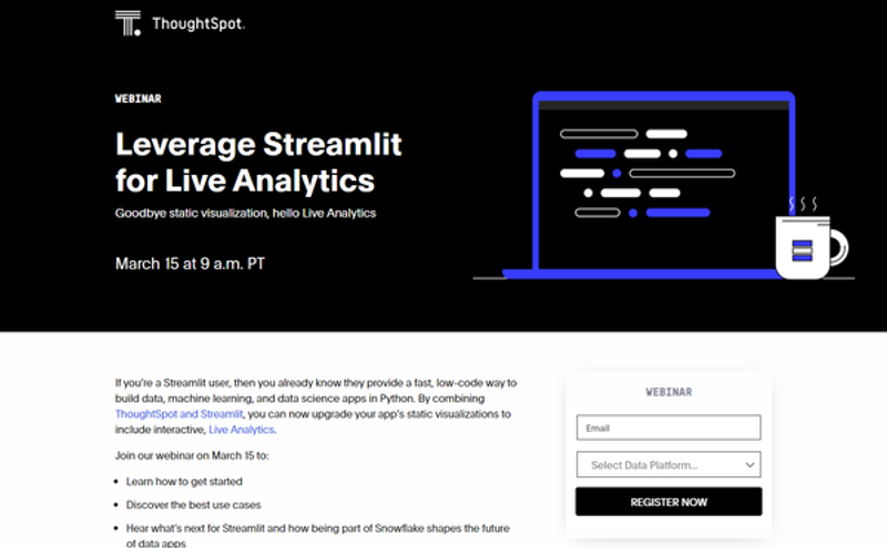
What we 🧡:
- Highlights that it’s a live webinar
- Succinct description
- Bulleted takeaways
What we’re missing:
- Stronger CTA button
6. Seismic’s best practices webinar
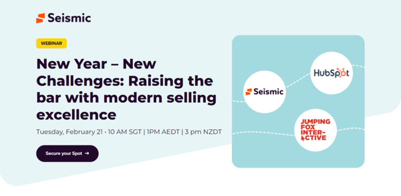
What we 🧡:
- Great CTA
- Eye-catching design and logo placement
- Easily accessible time and date details
- A ‘who should attend’ section to increase inclusivity
What we’re missing:
- Speaker bios could be more concise
7. Superside’s Gather & Grow series
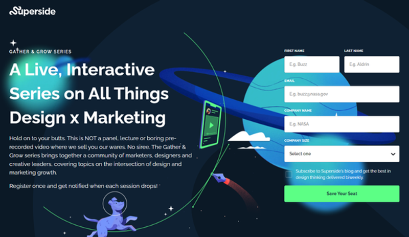
What we 🧡:
- Design immediately captures visitors’ attention
- Simple registration form
- Standout CTA button
- Branded speaker headshots with links to bios
- Clear ‘what to expect section’
What we’re missing:
- No end benefit in headline
8. PandaDoc’s LinkedIn Live event
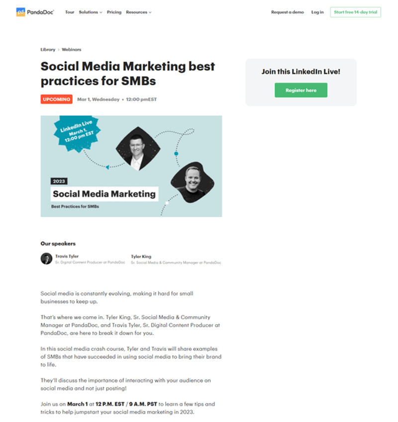
What we 🧡:
- Succinct speaker intros
- Branded headshots
- Bolded time and date details to catch the eye
What we’re missing:
- Registration link takes you off-page
9. Zuora’s partner webinar
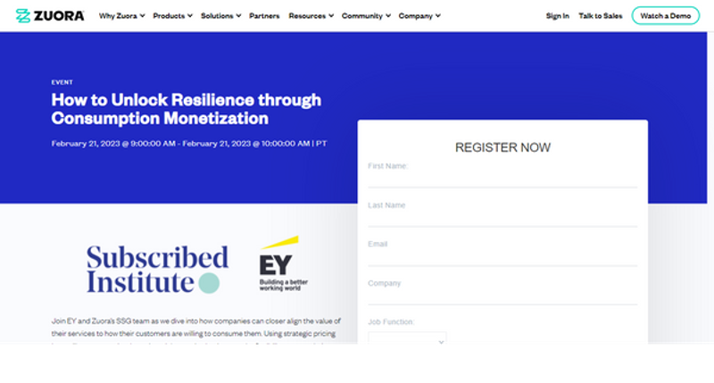
What we 🧡:
- Title speaks directly to target audience
- Eye-catching partner logos
What we’re missing:
- More CTAs
10. SureCo’s deep dive webinar

What we 🧡:
- Clear header title
- Easily accessible time and date details
- Speaker headshots with links to bios
- Bullet points with clear attendee takeaways
What we’re missing:
- More CTAs
11. Introhive’s product impact webinar
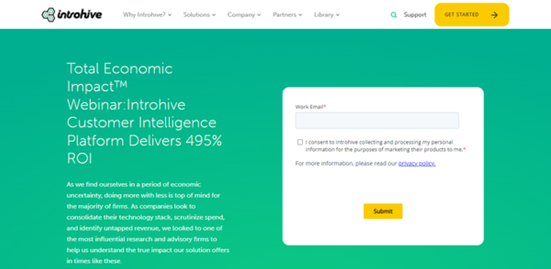
What we 🧡:
- Benefit-driven header title
- Timely webinar description
- Simple registration
What we’re missing:
- Stronger CTA
12. Smartling’s Reality Series

What we 🧡:
- Instantly recognizable branding
- Short but enticing description
- Front-and-center social media buttons
What we’re missing:
- Stronger CTA
13. Lattice’s expert-led webinar

What we 🧡:
- Succinct ‘what you’ll learn’ section
- Speaker headshots
- Easy-to-find time and date details
What we’re missing:
- Shorter benefit-driven title
14. 1Password’s Tiny Tutorials
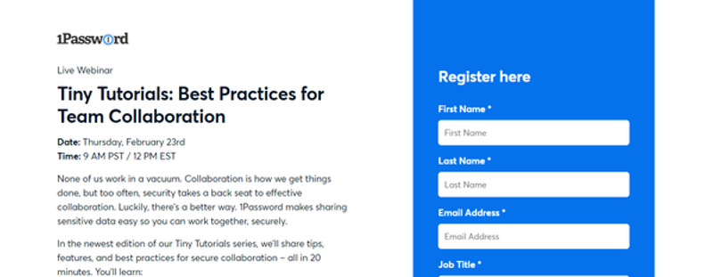
What we 🧡:
- Central logo
- Clear title
- Time and date details can’t be missed
- Scannable ‘What you’ll learn’ section
What we’re missing:
- Shorter registration form
15. Sisense’s deep dive webinars
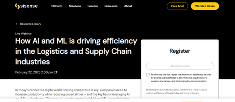
What we 🧡:
- Clear value prop
- Speaker bios
- One-field signup form
What we’re missing:
- Benefit-driven title
- Stronger CTA
What every high-converting webinar landing page should include
When it’s time to create your page, it’s critical to keep the end goal in mind. The single aim of your webinar landing page is to increase signups.
Clunky UX, missing contact info, competing CTAs — these seemingly ‘minor’ oversights fly in the face of the latest webinar landing pages best practices and could cost you attendees.
Review your pre-event promo checklist to make sure each of the following conversion-ready elements is included.
Webinar title
In the wild world of webinar marketing, your title is the equivalent to a first-meeting handshake — don’t make it a dead-fish experience for your prospects. Come at ‘em strong with a title that highlights what’s in it for them.
- Avoid jargon — your title should be accessible, just like your webinar itself.
- Give it a clear purpose with imperatives like: ‘learn how to’, ‘gain more’, ‘increase by x%’.
- Don’t include the word ‘webinar’ in your title. Our research has found an almost 50% drop in registration when this word is included in the event name.
Body copy
Once your title has hooked their interest, position your body copy to swoop in and seal the deal.
This isn’t the time for War and Peace. When it comes to your body copy, you want to keep it short-form. Avoid lengthy walls of text and instead opt for short paragraphs supported by easy-to-read bulleted sections. Tell visitors what the topic is and what they stand to gain from attending, without giving the game away entirely.
- Ensure your copy addresses your prospect’s pain points and motivations for attending
- Align each topic area with a key benefit for the audience
- Keep your copy concise — short paragraphs and bullet points with an easy-to-read font
- Present key details in easily scannable bullet points
- Use urgency to increase conversions
Webinar topics
Your webinar format and topic has to be good. Don’t even think about hitting publish on your landing page until you’re sure you’ve nailed the angle. Here are some tips to help.
- Don’t go too niche — especially if your webinar success metrics are volume-based
- Don’t go so broad that it’s hard for attendees to see a direct incentive
- Mix things up — don’t go for the same webinar topics your competitors are using
Webinar speakers
Guest speakers are often a big part of the draw when it comes to why attendees register for webinars. And if you’re splashing the cash to get them there, you definitely want to make the most of their name and fame.
Present a short bio including your speaker’s name, position, current company, and a short and snappy sum-up of why you can’t afford to miss their session.
- Add a branded headshot to build trust with visitors
- Use a video teaser to get visitors excited
- Link your speaker’s bios to their LinkedIn or website to keep text short
Social proof and testimonials
Let’s face it, social proof speaks louder than you ever could. By adding a few choice testimonials to your page, you allow attendees to learn how your webinar has helped others and move them one step closer to sign-up.
- Include some identifying characteristics — name, company, geographical location, etc.
- Resist the urge to over-edit — tweak any major spelling or grammar errors but still keep it real
- Use real screenshots from past webinar chats or social media buzz
- Use testimonials to speak directly to any common objections — e.g., taking the time out to attend
Company name and logo
In a crowded webinar landscape, your virtual event branding matters more than ever—but you’d be surprised how many folks forget to position their company name and logo front and center.
With the right webinar landing page builder, this part is to automate and customize. Once you’ve got your webinar landing page template in place, all you need to do is check your links and replicate.
- Link your name and logo to your home or product page
- Pay extra attention to details like your webinar landing page footer and favicon
Social media
If you want to broaden your attendee reach and really drive those webinar registrations, social media is another digital event branding feature you can’t afford to skip.
- Embed all social media channel logos into your landing page
- Test each link to make sure it works before you take your page live
Phone number
Providing a phone number isn’t something you always see on a webinar landing page, but the truth is, folks have questions. If it’s an option, adding a phone number is a great way to help them get the answers they need to commit to signing up.
- Provide your support teams with a list of FAQs and answers about your event
- Offer live chat as an alternative to a phone number
Countdown timers
Countdown timers are a great way to heighten the sense of urgency around registering for your webinar and boost your registrations as a byproduct.
- Sprinkle in some urgency — e.g., limited tickets, only X spaces remaining, etc.
- Trial a countdown timer with an offer attached to it.
Pop-ups
Love ‘em or hate ‘em, pop-ups are attention grabbers. But they have to be deployed carefully.
- Use an exit pop-up or time-delay your pop-up by 15 to 60 seconds to allow the visitor time to take in what they’re seeing
- Avoid being overly aggressive or spammy with your pop-ups — make it’s easy to close out of
Registration form
Nothing scares off a webinar prospect like a 20-field registration form. Of course, that doesn’t mean you have to scrap them altogether. As with pop-ups, your success is all in how you use them.
- Make it easy to find and complete
- Limit the number of fields to essential info only
- Make sure mandatory fields are clearly denoted
- Provide default values for as many fields possible
Call to action (CTA) button
There’s nothing too compelling about the word ‘submit’. While you never want to lose clarity for the sake of creativity, a little extra attention to your CTA placement, branding and button copy can go a long way in increasing your conversions.
- Try ‘Join us’, ‘Sign me up’ or ‘Learn how’ as alternatives to the overused ‘Register’ and ‘Submit’
- Use a CTA that reiterates what attendees will be getting out of your webinar
4 bonus tips for a high-converting registration page
1. Keep it eye-catching
When it comes to the latest webinar tips and best practices, custom branding is high on the list.
Use a range of deep customization options — from themed backgrounds, colors, custom gradients, fonts, and more — to make sure your brand is instantly recognizable from the moment visitors land on your page.
And if you need a little more inspo, don’t miss these attention-grabbing examples of branded digital events.
2. Take time to A/B test and optimize
Use A/B testing to make small changes that could have a big impact on your conversion rate
For example, if you see fewer registrations, you could try reducing the number of mandatory fields to see if it increases your conversions. And don’t forget to test on a variety of mobile devices to make sure it’s easy for folks to sign up, even on the go.
3. Make your webinar content available on-demand
Your registration page doesn’t have to become obsolete once your event is over.
By making your virtual event available on demand, you can capture post-event sign ups long after your webinar closes.
4. Use automatic calendar holds
It’s a sad fact of life, but your webinar isn’t always going to be central in someone’s mind.
While most of us have the best intentions when we register for a webinar, life has a way of getting in the way of actually showing up to an event.
With automatic calendar holds, registered attendees immediately receive a time-zone adjusted calendar invite with key event details so that it’s right there where they can see it.
Instead of having to manually ‘add to calendar', all your attendees need to do is accept the invite and they’re ready to roll.
Land your next landing page with Goldcast’s webinar page builder
At Goldcast, we work with leading B2B event marketers who always aim to knock it out of the park with their webinar marketing strategies.
Brands like Drift, Alyce, Amplitude, Zuora, and more have all been using webinars to meet—and exceed—their marketing goals.
Whether it's getting more signups and attendees, increasing time spent in the event, or sending the perfect webinar email sequence, we're here to help you maximize your webinar ROI at every step.

Transform Your Video Marketing with AI
Stay In Touch
Platform
Resources
© 2025 Copyright Goldcast, Inc. All rights reserved.



 Upcoming Events
 Event Series
 On-Demand Events