14 Powerful Webinar Invite Email Examples to Boost Your Attendee Count

Table of Contents
Maximize Your Marketing ROI
Join 10,000 other marketers already getting the best tips on running engaging events that boost pipeline and create raving fans.
No matter the industry you're in, webinars are a fan favorite.
They’re short, accessible, and educational—a triple threat of event awesomeness for busy professionals who want to learn and network, but don’t have time for three-day workshops.
But as the popularity of webinars has increased, so has the competition. With a limited number of hours in the workweek, securing registrations and then getting people to actually show up to your webinar requires intention, impact, and a highly compelling webinar email sequence.
And it all starts with that very first webinar invite email.
If it’s been a while since you’ve given your webinar invite email template a refresh, we’ve got you covered. These powerful examples of real webinar invite emails will inspire you to create (or recreate) your own impactful template for maximum attendance.
What we’ll cover:
- The 4 main types of webinar invite emails
- 10 powerful webinar invitation examples — why they work
- Free webinar email template

The 4 main types of webinar invite emails
There’s more that goes into a webinar invite email than first meets the eye.
In fact, there are a few different sends that go into a single webinar email campaign.
Each webinar invitation email has its purpose and information, but the aim remains the same — to create consistent messaging that converts the reader to register and attend your webinar.
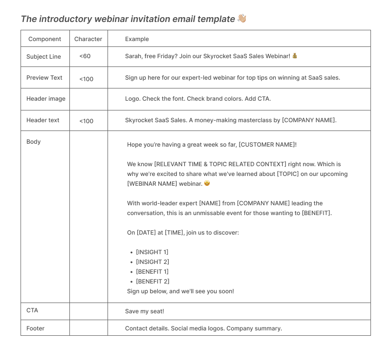
Webinar email template #1: Introduction + invitation
A webinar email invitation is the first email your attendees receive when you first announce your webinar and officially open for registration. Which arguably makes it the one webinar email you really need to nail.
📆 When to send: Between two and four weeks before the event.
Webinar email template #2: Confirmation email
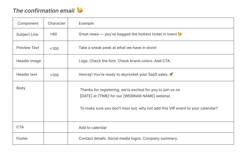
When a potential attendee registers for your webinar, the confirmation email immediately goes out reminding the attendee of all the key details for the webinar.
Depending on your online event platform, you can use automation so that when someone fills out the registration form on your webinar landing page, your webinar confirmation email and calendar invite are automatically sent letting them know their place has been reserved.
📆 When to send: Automated to send upon registration.
Webinar email template #3: Reminder email (for no replies)
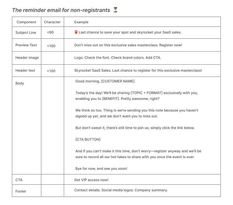
Not everyone is going to be convinced to join your virtual event the first time they hear about it. Maybe they need to check their calendar, wait for a quieter moment to register, or simply require a little more information before committing their time.
That’s why follow-up emails are crucial. You’ve planted the seed, but don’t just sit back and hope it grows into a registration — nurture it and ensure it does.
📆 When to send: two weeks before, one week before and one day before/day-of the event.
Webinar email #4: Reminder email (for registrants)
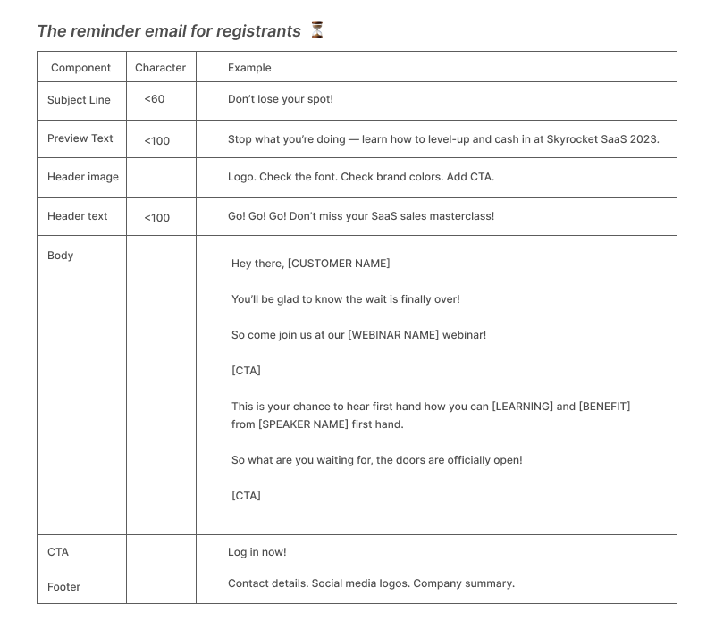
No matter how much we try, we humans forget things. Send a few gentle webinar reminder emails and treat them as you would any other lead nurturing email.
Remember, registrants aren’t attendees until they show up. Lead with value to keep the relationship warm and prospect-focused.
📆 When to send: three days before, one day before, one hour before and at the webinar start time.
10 effective webinar invitation email examples—why they work
Once you’ve got your webinar email templates outlined, it’s time to start writing.
There are seven key components that make up a high-converting webinar invite email. In this section, we’ll run through each one using a clear example of a real webinar invite email we love.
1. Email subject lines
What is an email subject line? The first line of text your webinar prospects read when they see your invitation and quite possibly the most important element of your webinar invite email. Almost half of recipients open emails based on the subject line alone, so it’s crucial to get this part right.
Best practices for webinar invitation subject lines:
Use words that draw the reader in: ‘Free’, ‘Join us’, ‘Last chance’, etc.
- Example: Tune in to learn what attendees ~really~ want
Turn statements into questions.
- Example: Free Tuesday?
Use emojis to stand out.
- Example: [LIVE Webinar] 8 Keys for Falling in Love with Your Business love ❤️
Personalize the recipient’s name.
- Example: Hey Tom, want to learn about…
Use a clear call to action.
- Example: Grab your VIP ticket now…
- Stick to ~60 characters
Webinar invitation subject line examples
👋🏼 Introductory email: Make your offer clear and intriguing.
Example: Sarah, free Friday? Join our Skyrocket SaaS Sales Webinar! 💰
🥳 Confirmation email: Have fun with this one, get them excited.
Example: Great news — you’ve bagged the hottest ticket in town! 🥳
⏳ Reminder email for non-registrants: Build on the intrigue and urgency.
Example: 🚨 Last chance to save your spot and skyrocket your SaaS sales.
⏰ Reminder email for registrants: Stress the urgency and make sure this final reminder stands out.
Example: Don’t lose your spot!
What we love about this subject line example from Hootsuite:
- Uses a question to get your target audience thinking
- Includes succinct details of what the webinar is about

What we love about this preview text example from The Wild Apricot:
- Clear sense of urgency
- Reminds the prospect what they could be missing

2. Preheader/preview text
What is the preheader/preview text in an email? Appearing next to the subject line, the preheader or preview text does exactly what it says on the tin — gives the reader a preview of what to expect when they open your webinar invite email.
Best practices for webinar invite email preheaders:
- Keep it under 100 characters.
- Try to quickly answer the what, why and how.
- Fill any information gaps left by the subject line.
- Read it out loud to ensure it flows seamlessly from your subject line.
- Don’t just repeat your subject line text.
Webinar invitation email preheader examples
👋🏼 Introductory email preheader example: Sign up to our expert-led webinar for top tips on winning at SaaS sales.
🥳 Confirmation email email preheader example: Take a sneak peek at what we have in store!
⏳ Reminder email for non-registrants email preheader example: Don’t miss out on this exclusive sales masterclass. Register now!
⏰ Reminder email for registrants email preheader example: Stop what you’re doing — learn how to level-up and cash in at Skyrocket SaaS 2023.
What we love this preview text example from BuzzSumo:
- It answers the what, the why and the how
- It follows on seamlessly from the subject line
- It lets the reader know how much time is left to register

3. Header image
What is a header image? As the first image readers see when they open your email, this is the introduction that sets the tone for what’s to follow and keeps the reader engaged with your webinar invite email. It needs to pack a punch.
Best practices for webinar invite email headers:
- Keep your header branding consistent across your webinar invite emails, e.g. fonts and colors.
- Include your company and/or event logo.
- Add a powerful image that speaks to the event topic.
- Consider using GIFs or animation.
- Add a clear call-to-action button.
What we love about this header image example from Talogy:
- It’s on-brand
- The key details can be seen at a glance
- It has an unmissable CTA to ‘Register Now’

4. Email header + optional sub-header text
What is an optional email sub-header text? This is the text that goes with your header image or replaces the need for an image.
Best practices for webinar email header text:
Asking leading questions.
- Example: Why should B2B companies think like a media company?
For the sub-header, cut straight to the key info—date, webinar title, names/headshots of keynote speaker, webinar host, etc. Reiterate what’s in it for the reader.
- Example: Ready to raise your revenue?
Include the webinar format.
- Example: An exclusive roundtable with…
Incentivize the reader to keep reading.
- Example: The 5 steps you need to know, in order to grow
Explain further details about the webinar (especially if your webinar title doesn’t give much away).
Webinar invitation email header text examples
👋🏼 Introductory email example: Skyrocket SaaS Sales. An exclusive masterclass by [COMPANY NAME].
🥳 Confirmation email example: Hooray! You’re ready to skyrocket your SaaS sales. 🚀
⏳ Reminder email for non-registrants example: Skyrocket SaaS Sales. Your last chance to register for this exclusive masterclass.
⏰ Reminder email for registrants example: Go! Go! Go! Don’t miss your SaaS sales masterclass!
What we love about this header text example from…us 😉:
- It repeats the name of the webinar (and the webinar series)
- It contains all the key details — day, date, time, topic and speaker details

5. Body text
What is email body text? The main text component of an email that shares all details, answers frequently asked questions, and gets the audience excited to attend.
Best practices for webinar email body text:
- Keep your language concise and compelling.
- Be sure to include the key details about the webinar
- Reiterate the value proposition.
- Use urgency to drive action.
Webinar invitation email body text examples
👋🏼 Introductory email:
- What: The webinar topic.
- Why: The need for the topic, why it’s relevant for the reader, and what value they’ll get from attending.
- When: The webinar date, time, and how they’ll access it.
- Who: Introduce the big name speakers or presenters. Quickly highlight their experience, education, and achievements to establish credibility. Add a headshot or video snippet.
- How: This is your call to action (CTA). Highlight the registration button to make it easy for readers to find.
🥳 Confirmation email:
- Confirmation: Let the reader know that they are registered.
- Calendar block: Include an ‘Add to calendar’ option.
- Registration link: Add a magic link for the webinar attendees to join the event without extra login credentials.
⏳ Reminder email for non-registrants:
- Urgency: last chance, final reminder, hurry, etc.
- Repeat the details: time, date format.
- Repeat the main draws: freebies, VIPs, 1:1 advice, etc.
- Repeat what the reader will gain: knowledge, help, skills etc.
⏰ Reminder email for registrants:
- The essential info: date and time.
- Add to calendar option
- Magic link
- A link to invite friends and peers
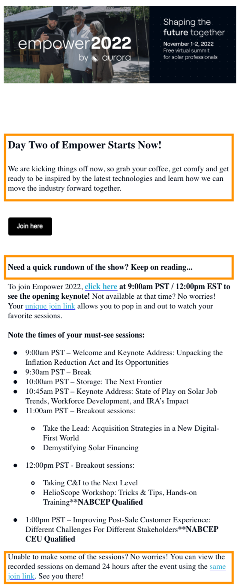
What we love about the body of this example from Aurora:
- Includes all the key details you need
- It has a super short message and quick CTA
- Provides agenda
- Reshares the registration link to join
- Gives readers an additional on-demand option if they can’t make it
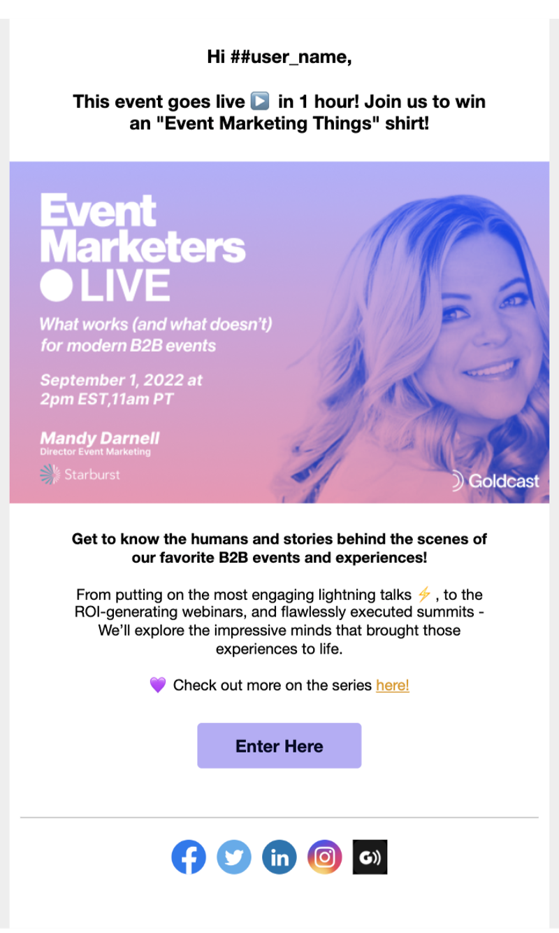
What we love about the body of this example email from…ok, us again 🫣:
- Instant and tangible benefit to joining (who doesn’t love swag?!).
- Contains all the info you need and a sweet visual of the VIP speaker
- Uses playful emojis to set a fun vibe
- Provides a clear CTA for easy webinar access
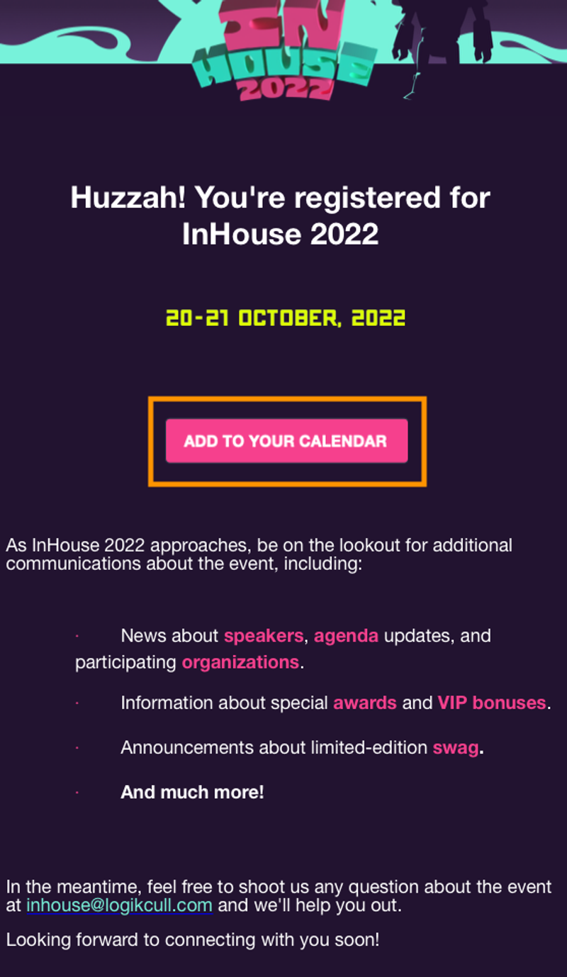
What we love about the body of this example email from Logikcull:
- Language and email design are on-brand
- Text succinct
- The CTA really stands out
6. Call to action (CTA)
What is a call to action? A prompt designed to inspire an action to be taken, usually in the form of a button.
Best practices for webinar email CTAs:
Ensure your wording is clear and action-orientated.
- Example: ‘Download agenda’
Use the first person where possible.
- Example: ‘Book my space’
Level-up the urgency factor.
- Example: ‘Get it now’
Keep the CTA large enough to stand out even if you squint your eyes.
👋🏼 Introductory email: your main aim here is locking in registrations.
Example: Save my seat!
🥳 Confirmation email: you’ve acquired the registrant, but in order to get them there on the day, focus on getting the webinar date in the diary (literally).
Example: Add to calendar
⏳ Reminder email for non-registrants: as the reminder email count increases, so does the urgency, so add in some exclusivity ideas.
Example: Get VIP access now!
⏰ Reminder email for registrants: these emails are all about making it as easy as possible for your registrant to actually show up, so use magic link technology for direct CTA access.
Example: Log in now!
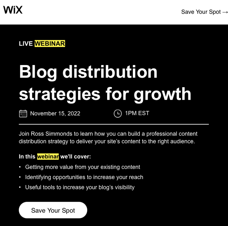
What we love about this CTA example from Wix:
- The white button stands out against the black background
- CTA text uses an action verb / imperative ‘save’
- It’s playful — ‘register now’ can become a little lackluster
7. Footer
What is an email footer? The part at the very end of your email containing an unsubscribe link, any legal disclaimers, your company’s address, etc.
Webinar email header text best practices:
- A contact email address (for those curious, but with questions).
- Social media links.
What we love about this footer example from ThoughtSpot:
- It succinctly states what the company does.
- Includes contact details for those with questions.
- Social media channels are easy to find.

Ready to create your own high-converting webinar email sequence? Download our complete set of tried-and-tested templates to increase your registrations!
First step to winning at webinars: complete ✅
Winning a healthy number of webinar registrations is no small feat in today's competitive email marketing landscape.
Your success starts at the beginning, with the first very email you send.
Don’t settle for out-of-the-box email templates that offer the bare minimum. Set the right tone for your webinar and get potential attendees excited by amplifying your branding, following the latest best practices, and enticing readers to click that ‘Register Now’ button at each and every step.

Transform Your Video Marketing with AI
Stay In Touch
Platform
Resources
Company
© 2026 Copyright Goldcast, Inc. All rights reserved.
YOUR PRIVACY CHOICES




 Upcoming Events
 Event Series
 On-Demand Events