16 Key Lessons from The Best (And Worst) Webinar Emails We’ve Seen

Table of Contents
Maximize Your Marketing ROI
Join 10,000 other marketers already getting the best tips on running engaging events that boost pipeline and create raving fans.
Over the last few years, the world of webinars has exploded. Today companies are hosting an average of 13 webinars per year.
But with that increase, comes stiff competition. With so many webinars competing for the same registrations, bagging time on your prospect’s calendar is getting harder and harder to do. To capture your recipient’s attention and boost your webinar registrations, there is one channel you must perfect: your webinar emails.
If you’re looking to elevate your webinar emails and ace your attendance rates, stick around.
We’re diving into the latest tips, examples and best practices from some of the best and worst webinar emails we’ve seen so far.
Here’s what we’ll cover:
- What makes a ‘good’ vs ‘bad’ webinar email?
- What to include in your webinar emails? 10-step checklist
- The top 6 ‘don’ts’ of webinar emails — common pitfalls to avoid

First, what makes a ‘good’ vs ‘bad’ webinar email?
Webinar email sequences are a cadence of email messages sent to event prospects and customers who opt into receiving marketing communication from your brand.
If you’re like us, you’ve likely received a webinar email (or fifty) in your professional career so far. And you’ve likely noticed that the standard for these emails varies dramatically — from spammy and snooze-worthy to genuinely helpful and engaging.
You know a good webinar email when you see it. But when you sit down to create your own, hitting just the right balance between informative and engaging can feel like a fine line to tread.
That’s where the right webinar email examples can help.
What to include in your webinar emails
Webinar email sequences usually start with a webinar invitation email and then resume a regular cadence of value-driven check-ins and reminders based on whether the recipient:
- Registered — in which case your sequence may also include calendar invites, information requests, agenda updates, login links, etc.
- Failed to register — in which case your sequence may also include further outreach emails, last chance reminders, incentive emails, etc.
The main goal of your webinar emails is simple — get folks to register for and attend your webinar.
But clinching the registration is actually just step one. If you want folks to show up and engage, you need a strong webinar email sequence that stands out from the crowd.
To help you cover all the right bases, we’ve created a simple 10-point checklist with a clear webinar email example for each.
✅ 10-step checklist for effective webinar emails
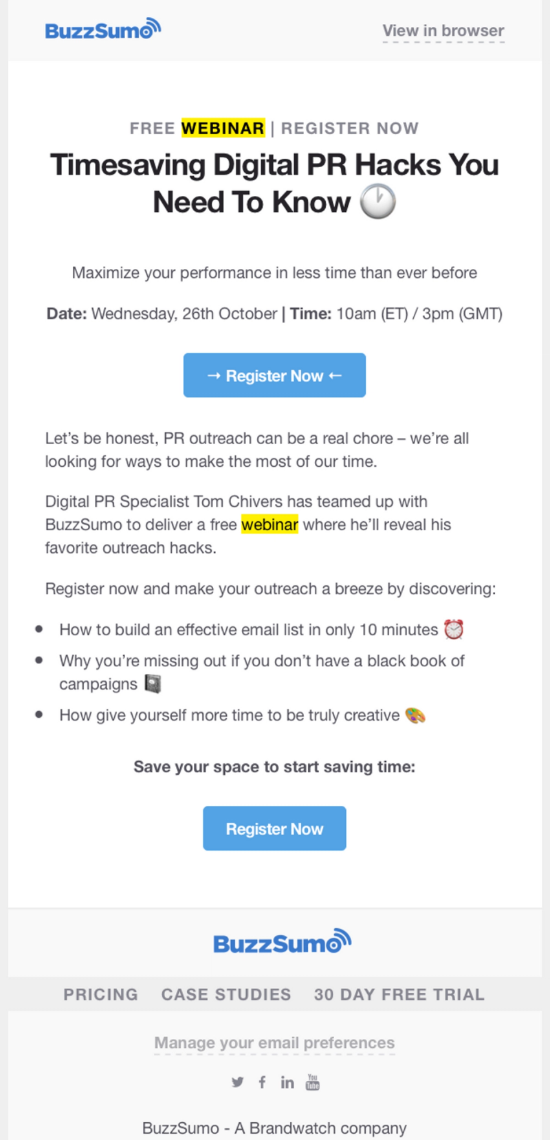
1. Answer the who, what, when, why and how
A good webinar email is nothing if not informative.
Skip any of the above, and you risk leaving your reader with unanswered questions that could mean the difference between reading and registering versus deleting and forgetting.
2. Make your subject line pop
You already know subject lines are crucial email real estate. But did you know that almost half of email recipients choose to open an email based solely on the subject line?
Of those who don’t open it, two-thirds will report it as spam after reading the subject line. Yikes! With webinar email subject lines, there are a few key things to remember:
- Personalize it — Use the recipient’s name where possible and natural
- Use action verbs — Learn, join, grab, book, etc. are all more exciting than ‘register’
- Add an emoji — To help your email stand out
- Keep it short — Aim for under 30 characters
- Pique their curiosity — Give the recipient a reason to read more
Last but in no way least, avoid using the word ‘webinar’ in your subject line and event name.
In examining the data from over 900 webinars, including 370,000 registrants and more than
118,000 webinar attendees, we found that there is almost a 10% drop in registration when
people see the word "webinar" in the event name.
Instead, get creative with your webinar programming, and try alternatives like ‘live event,’ ‘fireside chat,’ ‘office hours,’ etc. based on the format and topic of your webinar session.
3. Use a clear and compelling call to action (CTA)
Once you’ve got your reader’s attention, it can be tempting to ask them to do all the things.
But multiple CTAs can cause confusion and reduce your chances of conversion. Aim for one clear CTA repeated multiple times within the webinar email so that the reader has more than one opportunity to take action.
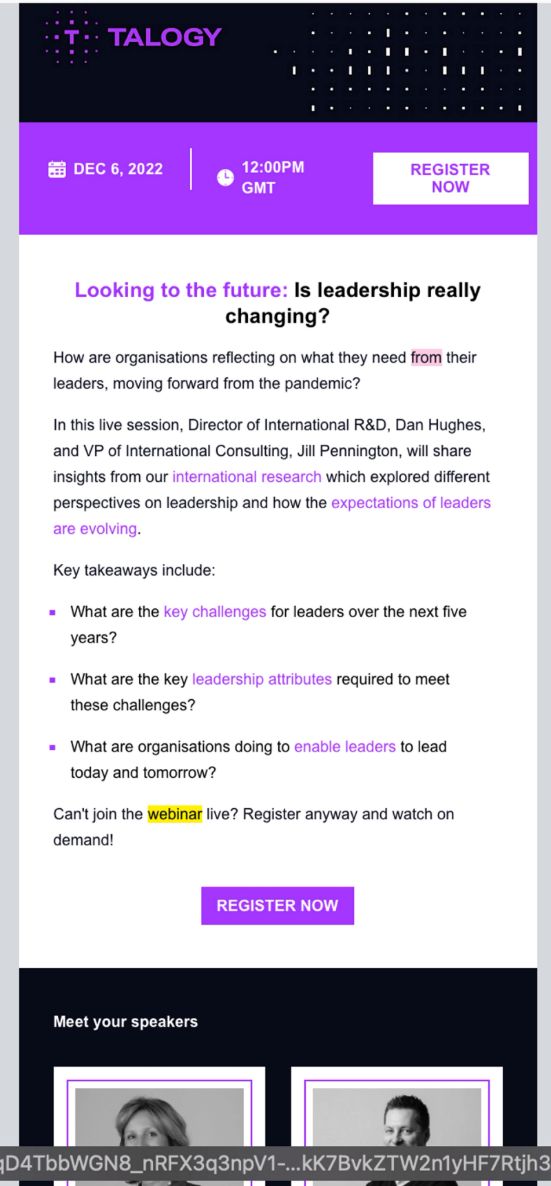
4. Go big on branding
Webinar emails are a huge opportunity to raise awareness and generate more demand for your brand. Take the extra time to make sure your email branding is consistent with your wider creative strategy by using the same colors, fonts, images, logo and tone. 🧡
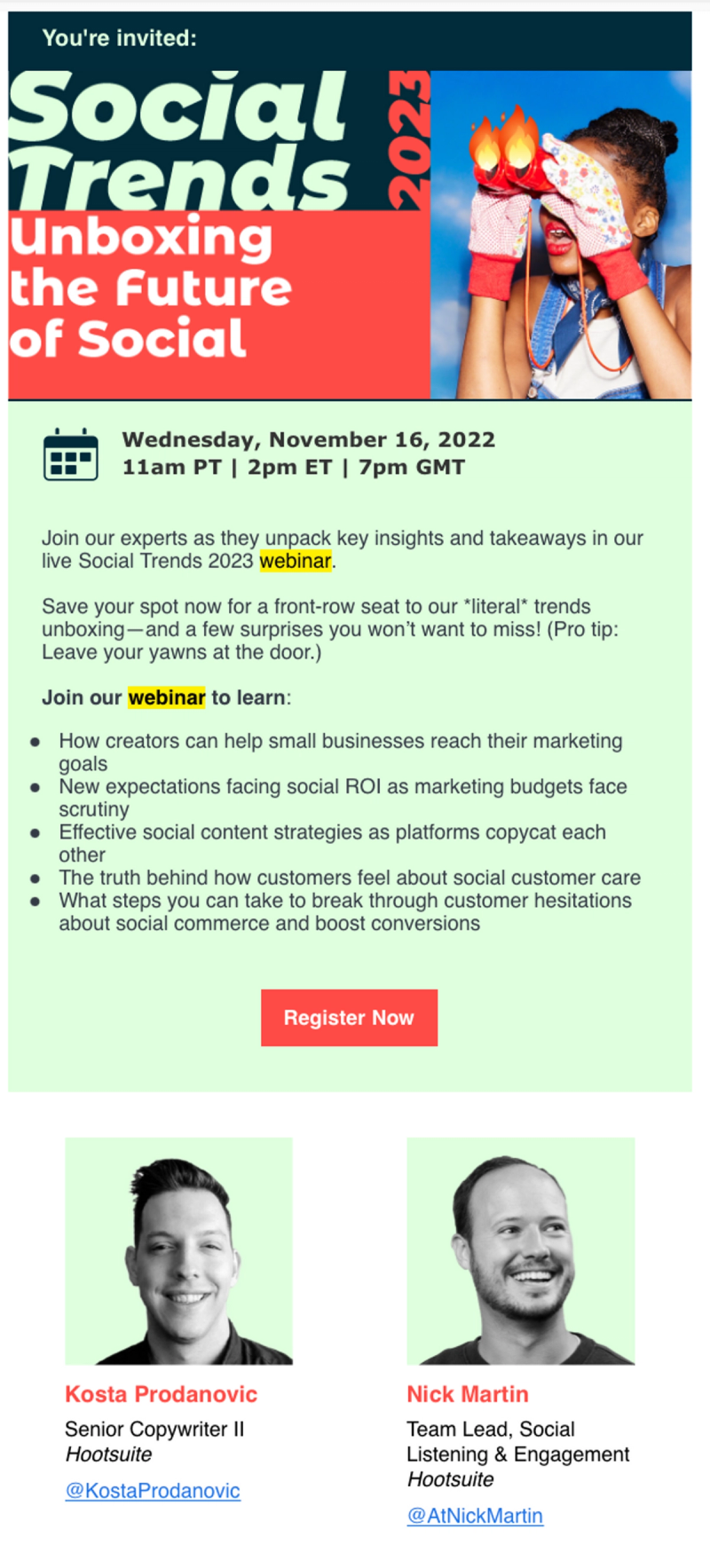
5. Use your email headline to make a strong first impression
Focus your headline on what’s in it for the potential attendee. What is the reader going to get out of attending your webinar? How will it benefit them at the practical day-to-day level?
Where possible, use an example, statistic, story or interesting fact to add extra intrigue and entice the recipient to take action.
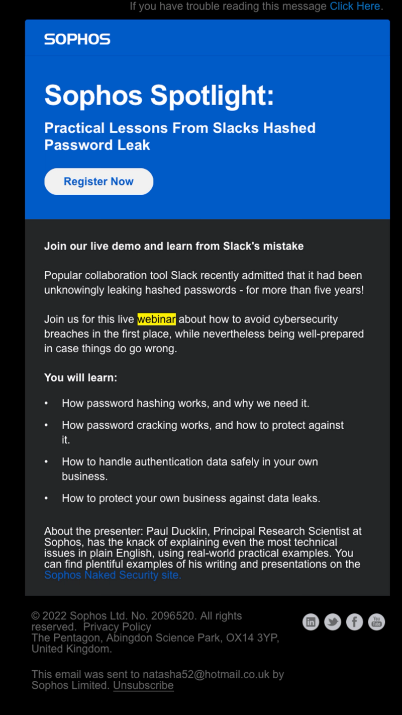
6. Add a GIF or video
If a picture really is worth a thousand words, a video or GIF can say even more, right?
Assuming it makes sense the tone and content of your webinar, adding a quick video, GIF or even meme to your webinar emails can be a great way to rise above the noise and capture your reader’s attention.
You can even use a GIF to create a sense of urgency in a humorous way instead of taking the more common high-pressure approach.
Similarly, a quick introduction video to tell the story behind your webinar theme or topic can be a great way to build a human connection with your webinar attendees before the event begins.
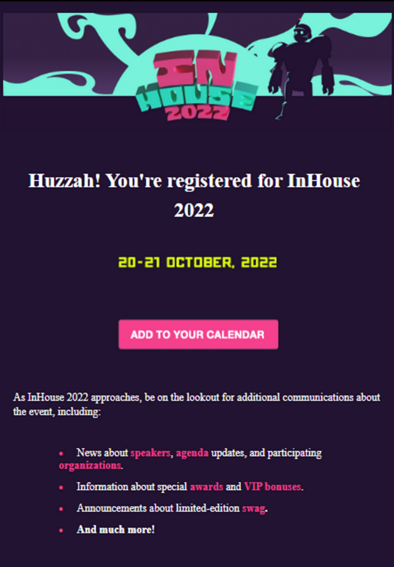
7. Send a confirmation email
Confirmation emails are a great opportunity to lock in your registrants with an easy ‘Add to calendar’ option. 📆
And believe it or not, attendees love ‘em!
Our research has found that 51% of attendees like to see automated calendar invites that are sent straight to their inbox upon registration.
With a simple calendar confirmation email, registered attendees will receive an automated reminder notification the day your event is happening, increasing their chances of showing up.
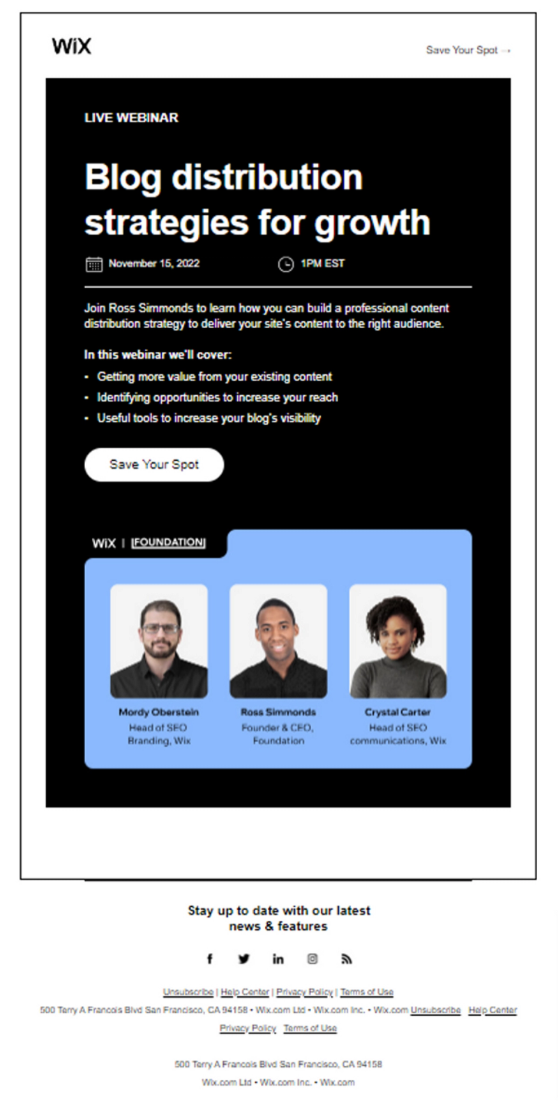
8. Zoom in on your speakers
Often it’s not the content that gets attendees to an event, it’s the folks delivering that content.
If you’ve spent time (and 💰) securing an industry top dog or a celebrity spokesperson to speak at your webinar, use that starpower to boost your registrations.
Adding your speakers’ photos, bios, session topics, or even a personal hello video, can inspire your readers to register and attend.
9. Send a last-minute reminder, just in case
Unsurprisingly, humans are fallible. Though they may have had the best of intentions when they registered, often they simply just…forget.
In our Attendee Sentiment Report for 2022, 49% of attendees say they want email reminders in the run up to the event and on the day of.
Sending a last-minute reminder email has a wealth of benefits for your webinar ROI:
- Healthier show rates
- A chance to share your can’t-miss agenda
- Opportunity to re-send your ‘how to enter’ instructions or event Magic Link
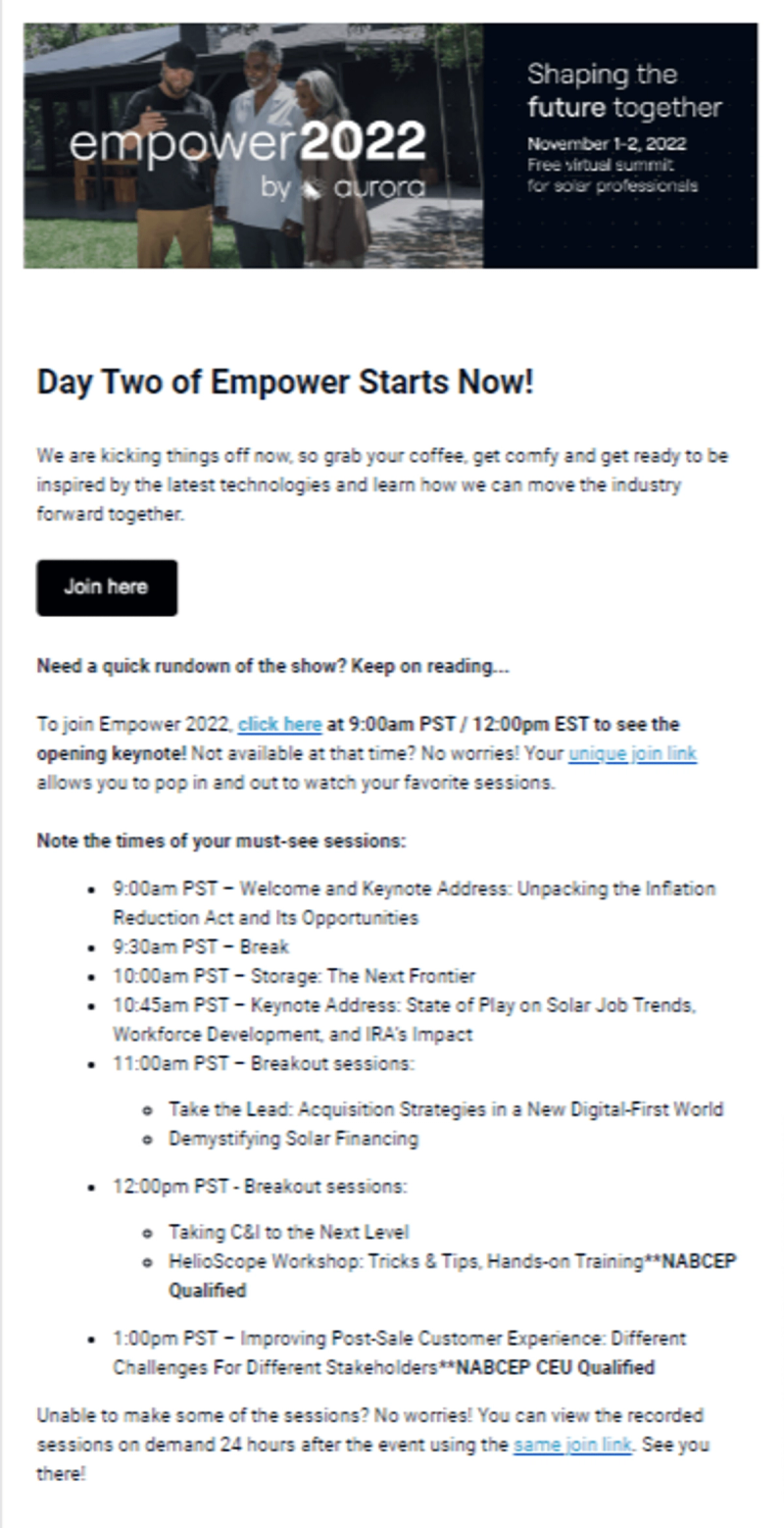
10. Offer access to on-demand content
Not everyone is going to make it to your webinar — and that’s ok. It still doesn’t mean they have to miss out on your content. And it certainly doesn’t mean you have to miss out on converting that prospect for future events.
In fact, 96% of B2B event-goers expect content to be available on-demand after an event session. Of those, 84% agree that it increases the amount of content they watch. On-demand FTW!
Consider adding a webinar email to your sequence that delivers on-demand access to the event recording to all ‘Registered failed to attend’ and/or ‘Failed to register’ contacts. And don’t forget about folks that ‘did attend’ too — they might want to re-watch or share with a colleague.
By offering the opportunity to catch up on-demand, you show that you’re ready to meet potential attendees where they are and continue to build a relationship that might otherwise have been lost. 🫶🏼
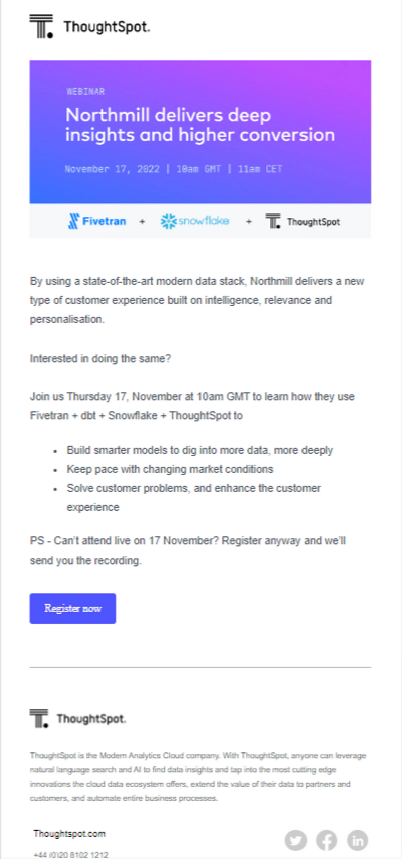
❌ The top 6 ‘don’ts’ of webinar emails — common pitfalls to avoid
1. Don’t write a novel
Let potential attendees know what’s in it for them. Avoid burying the lead (and the details) amid a bunch of less important information.
Succinct = successful.
Clocking in at around 300 words, the example below would have benefitted from a chop and edit to keep readers moving swiftly toward that CTA button.
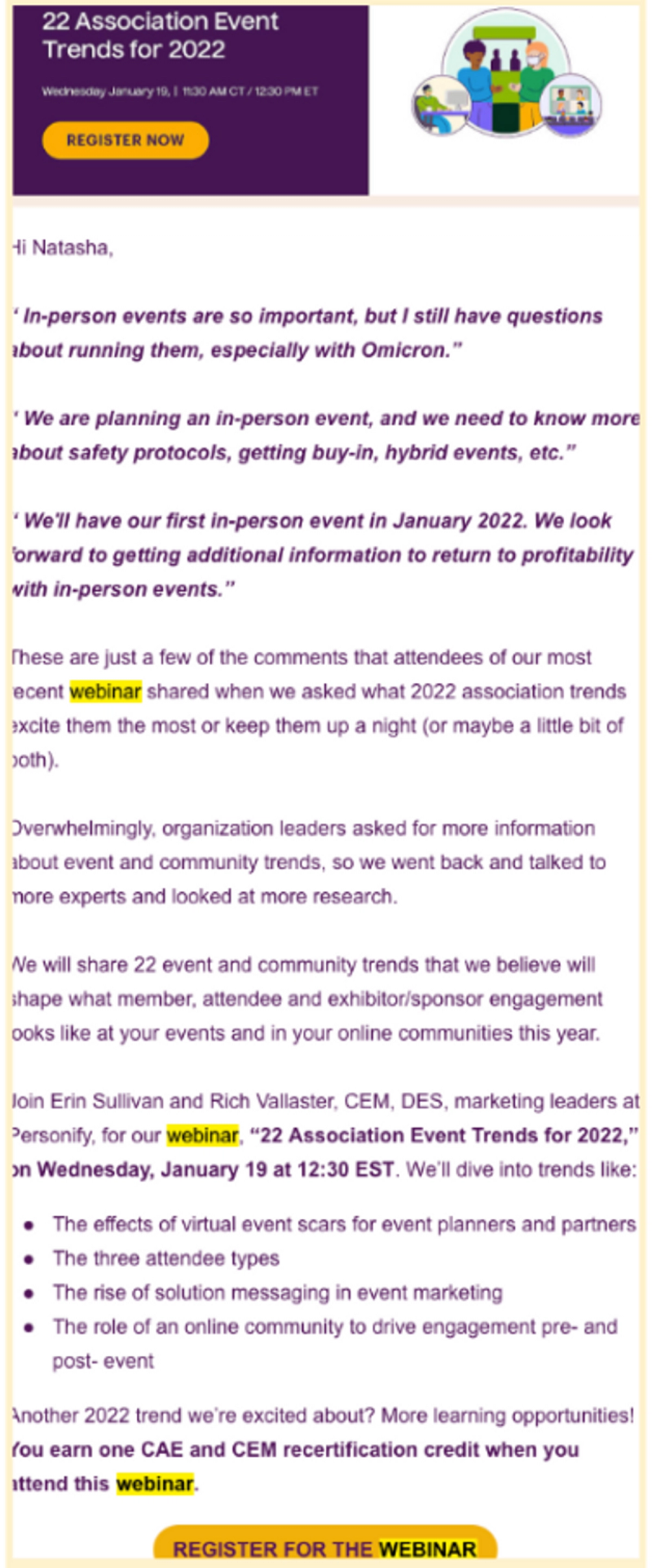
2. Don’t forget to brand it
Uninspiring webinar emails are a red flag to modern attendees. 🚩
After all, if you didn’t care enough to customize the email, why should they care enough to register?
Out-of-the-box templated webinar emails lack the white glove feeling busy business attendees are looking for.
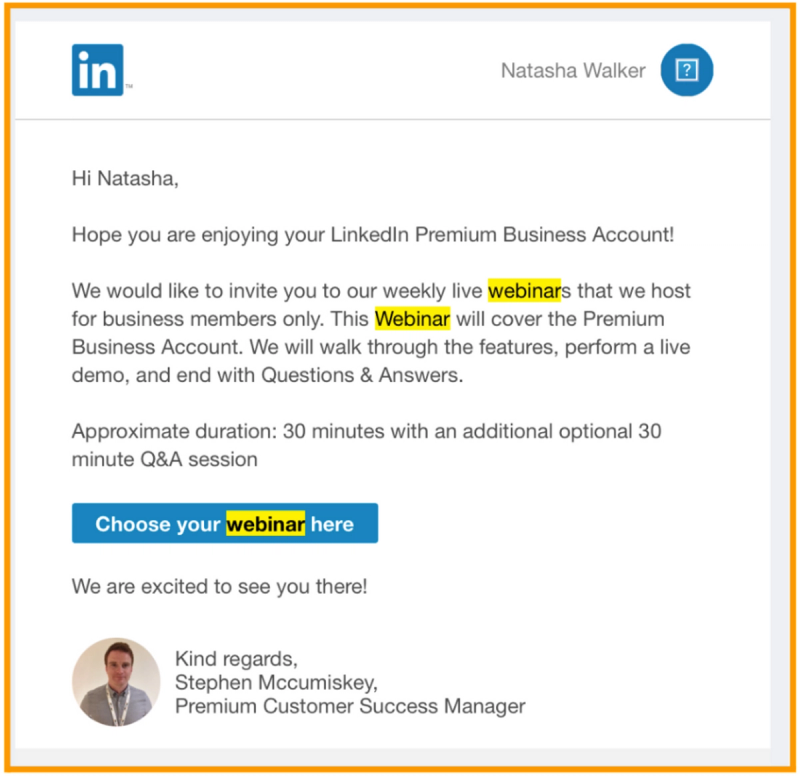
3. Don’t forget to remind folks!
There are a few key points in the user journey where it’s vital to tighten up your webinar email sequence:
- Right after you’ve marketed the webinar — Plant the seed with email one, and use the same language in your reminder email to reinforce the message days later.
- Right before registrations close — Last chance emails are a great motivator, so don’t be afraid to build a little urgency.
- Right before the event starts — While the other two touchpoints are key to driving registrations, this one is key to increasing attendance.
Always send a reminder email 15 minutes before the webinar begins to give registrants the time to grab a coffee, close some browser windows, and get ready to engage.
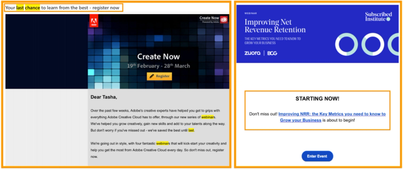

4. Don’t forget to QA check your webinar sequence
Before you fire up your webinar emails to go out to your entire list of potential registrants, take the time to audit the experience yourself.
Remember to send a copy of each and every email to yourself to proof on both desktop and mobile, and always check the opening line first to steer clear of any personalization glitches.
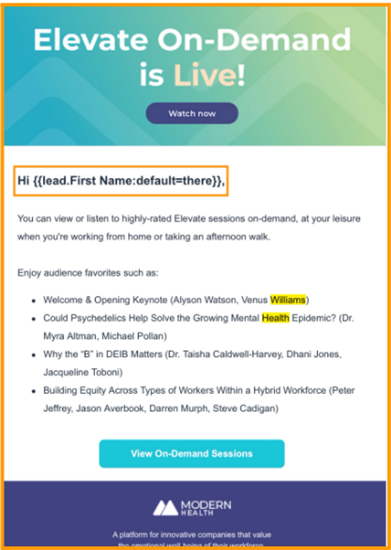
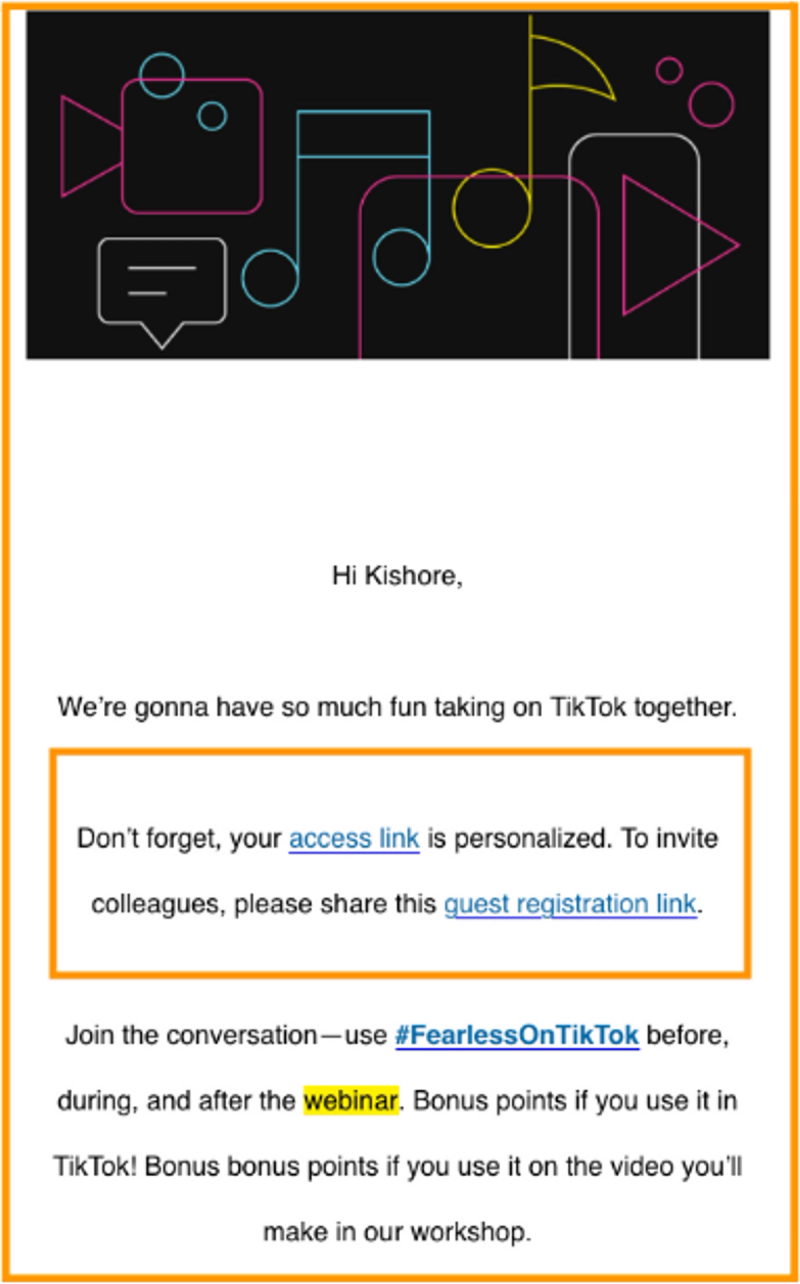
5. Don’t overcomplicate the event entry
No one wants to dig through multiple emails for one event login.
Make it easy for registrants to convert to attendees by eliminating the need for usernames and passwords with a personalized Magic Link. Webinar attendees will be able to enter the event with the click of a button
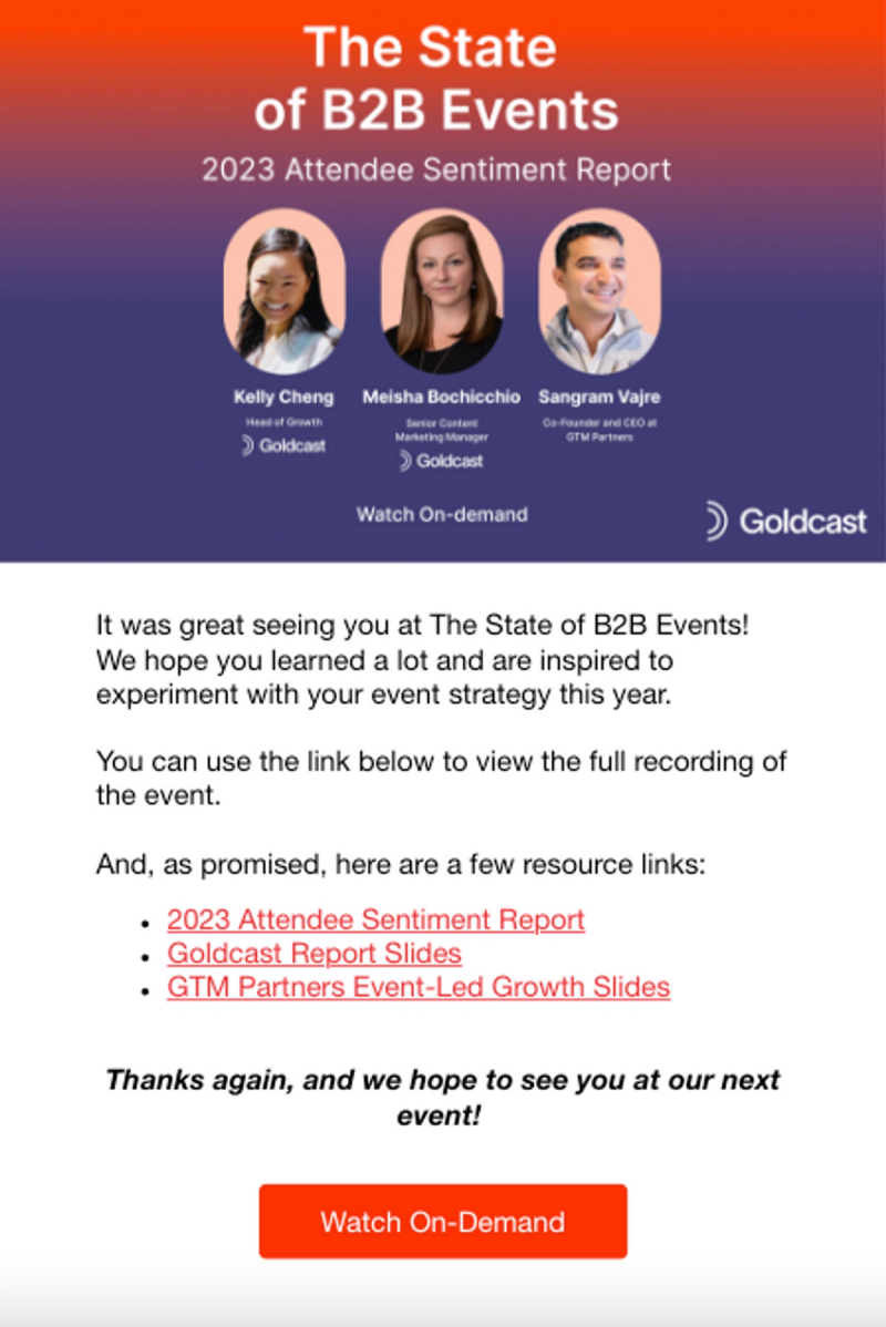
6. Don’t skip the follow-up
Once you’ve wrapped, your post-webinar email sequence should launch within 48 hours.
This is a prime opportunity to keep the engagement going and help attendees take the next step forward in their journey with your brand. Whatever you do, don’t skip this step!
A strong webinar follow-up email is designed to:
- Thank guests for coming
- Say ‘catch you next time’ for those who couldn’t make it
- Share relevant or missed webinar recordings
- Send related materials that may have been overlooked in the resource center
- Request feedback to improve and inform future events
- Share the details of future events
- Initiate a conversation with sales
Boost your webinar results with Goldcast
A high-converting webinar email doesn’t just translate into more registrations and attendees. It sets the tone of your brand story and builds awareness for your position as a thought leader within your industry.
At Goldcast, we’re big believers in giving event marketers the tools they need to create a memorable experience for digital event attendees, while amplifying their impact on brand growth and revenue.
Now that you’ve got a solid list of webinar email examples to pull from, you’re ready to increase those registrations and maximize your impact. Here’s to your webinar success! 🥂

Transform Your Video Marketing with AI
Stay In Touch
Platform
Resources
Company
© 2026 Copyright Goldcast, Inc. All rights reserved.
YOUR PRIVACY CHOICES




 Upcoming Events
 Event Series
 On-Demand Events